Your charts are about cases not deaths. If you want to make that point you need to show more data.
NOT DEATHS? The right hand graph is labeled DEATHS.
You can clearly see that the third peak has more cases but NOT as many deaths as peak #2. The Israeli government did something during the summer to get more cases but they didn't kill as many people as the earlier peak.
so WHY is virus suddenly less lethal than the earlier peak? We need to look at more data.
Undated graphs for Isreal for cases, deaths, and total cases


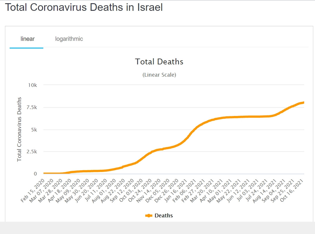
I think the third graph of total deaths might show what is going on the clearest.
In 2021, the vax was rolled out and the Israeli gubermint bought the lies that the vax would STOP the virus. More people died during that period than did from the initial virus scamdemic.
At the end of July, the Israeli gubermint rolled out a booster. The booster was one injection, the original poison death shot was two injections. That might be the reason more people died from the original innoculations as compared to the booster caused deaths.
Another possible explanation for the different vax caused death rates might be that the first vaccinations killed the most vulnerable.
I know some will cling to the explanation that the peak infection/death rate caused by the vaxxine explanation as just a coincidence but eventually, even the most senile, old fools will see that the vax is killing people.