To: UMCRevMom@aol.com
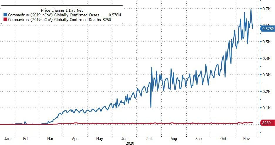
See this graph? See the first week in April where the people surviving the COVID are on the top line. Compare that with the red line below that. That was the number of deaths and it was the point at which the numbers of survivors out-weighed the deaths. That was the point where pandemic status no longer applied to the COVID.
We should have NEVER have been locked down and masked up.
And "cases" is the BIGGEST FRAUD PLAYED ON US!
Every night on the news, every radio news broadcast gives us the absolute "dire" "cases" count. Cases are nothing. Cases are people who have healthy immune systems who either have it minimally or have no symptoms at all and all those people are surviving.
We have been majorly lied to.
4 posted on
11/24/2020 12:14:40 AM PST by
Slyfox
(Not my circus, not my monkeys )
To: Slyfox
The graph is not showing cumulative, right?
It is showing new cases and deaths per day?
6 posted on
11/24/2020 12:24:11 AM PST by
Widget Jr
To: Slyfox
No COVID test is accurate. In fact, no doctor that I know relies on them because they are not accurate. A coin toss is just as accurate.
16 posted on
11/24/2020 1:56:00 AM PST by
CodeToad
(Arm Up! They Have!)
To: Slyfox
45 posted on
11/24/2020 5:56:17 AM PST by
azkathy
(We the people are FED UP-pun intended)
To: Slyfox
52 posted on
11/24/2020 6:51:19 AM PST by
Jane Long
(Praise God, from whom ALL blessings flow.)
To: Slyfox
We should have NEVER have been locked down and masked up.
And “cases” is the BIGGEST FRAUD PLAYED ON US!
Every night on the news, every radio news broadcast gives us the absolute “dire” “cases” count. Cases are nothing. Cases are people who have healthy immune systems, who either have it minimally or have no symptoms at all, and all those people are surviving.
We have been majorly lied to.
56 posted on
11/24/2020 8:03:33 AM PST by
Grampa Dave
( There was ZERO evidence of a free and fair election! What if Biden doesn't Concede?)
To: Slyfox
Great stuff thank you for posting this.
To: Slyfox
I felt the same way a few months ago. But currently in the hospital I work at in southern NJ we have 80 Covid positive patients.
We're seeing a substantial uptick.
102 posted on
12/03/2020 11:30:47 AM PST by
jmacusa
(If we're all equal how is diversity our strength?)
To: Slyfox
“We have been majorly lied to’’
Yup. Big time.
106 posted on
01/02/2021 1:52:19 PM PST by
jmacusa
(If we're all equal how is diversity our strength?)
FreeRepublic.com is powered by software copyright 2000-2008 John Robinson