Oh, and those number only account for 15% of all Federal Expenditures...specifically, block transfers of money from the feds to state budgets.
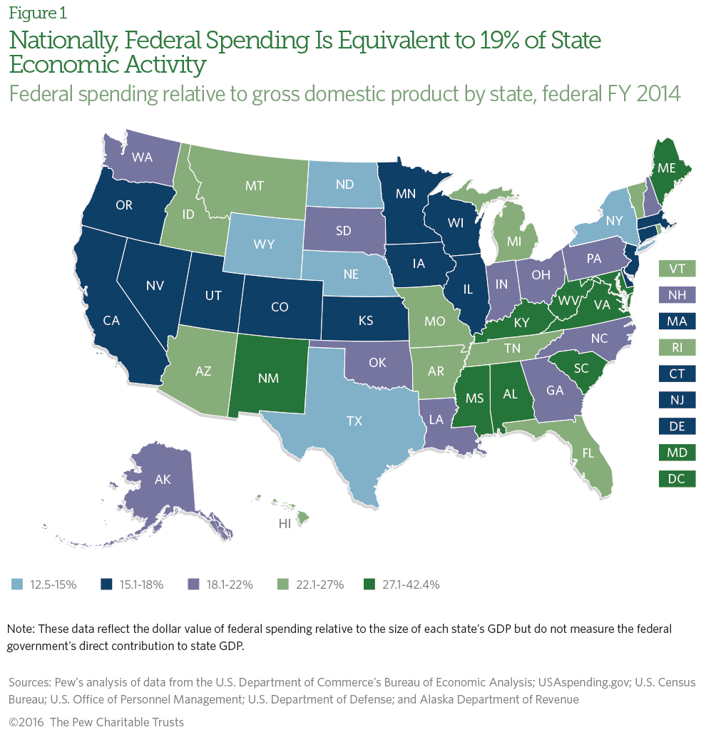
This chart delineates the % of budget in each state covered by Federal contributions. There are many ways to look at the complex nature of money paid out by the citizens and money returned to the state and individuals of that state by the Feds. The problem is that none of the methods accounts for all the factors. The budgets in the blue states are much higher because of the sanctuary cities and poor bugetary control so the states look like they are pulling a better percentage of their own weight but that is a spurious assumption. That is why I like the $/ individual I referred to earlier.
Against a national average of $1,935 in intergovernmental spending per American, red states receive just $1,879. Blue states get considerably more, at $2,124 per resident. Purple states see the least of their money returned to them per capita, at just $1,770. Measured in this way, the blue states are getting quite a bit more than the red or purple.
That data is not broken down by state anywhere I have seen.