Posted on 06/23/2016 9:56:08 PM PDT by NRx
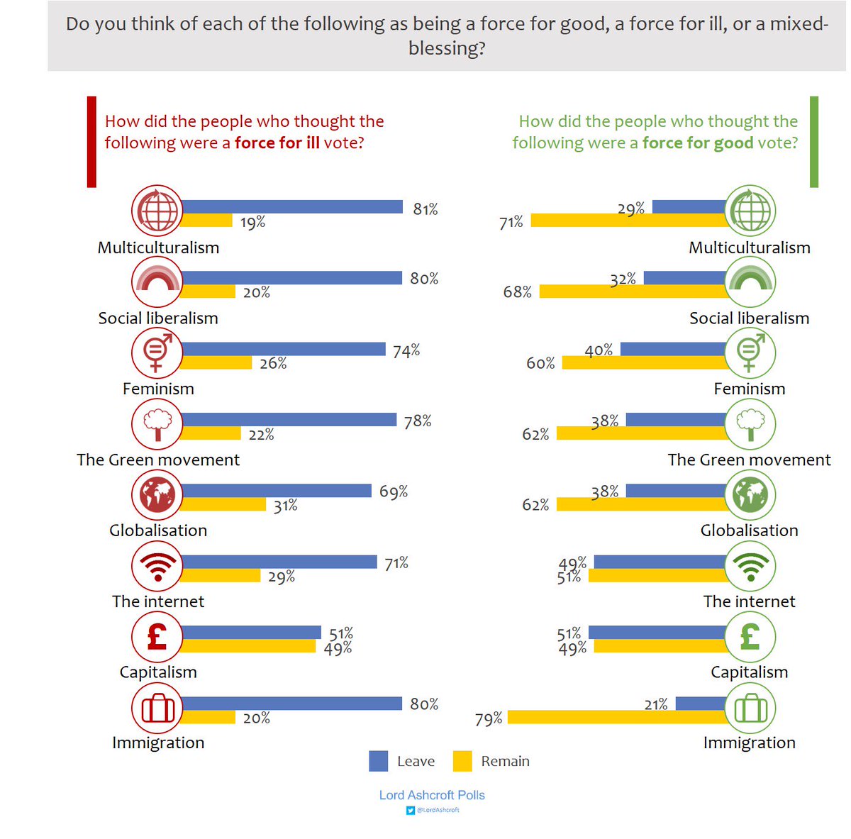
Is that chart a bit convoluted or is more coffee in order?
It struck me the same way as it did you.
The left side of the table represents people who are conservative in their views and the right side those who are liberal, so that layout alone can be confusing.
As for how it works, in the second question down on the left, of those polled who think social liberalism is a BAD thing, 80% voted to leave the EU.
On the opposite side, of those who thought social liberalism is a GOOD thing, 68% voted to stay in the EU.
I imagine that the percentages on opposite sides do not add up to 100% has to do with the Brexit election percentages themsleves and the quirks of the sampling size for the exit data.
The problem is that the UK needs the EU more than the EU needs the UK.
Those are just John Oliver talking points - there is no real evidence to back it up. The UK is the 5th biggest economy in the world.
If the remnants of the EU make it difficult on the UK, they will just make themselves less relevant as the UK can always expand its trade with non-EU members.
Besides, the EU has its own problems as other exits may be on the way.
Disclaimer: Opinions posted on Free Republic are those of the individual posters and do not necessarily represent the opinion of Free Republic or its management. All materials posted herein are protected by copyright law and the exemption for fair use of copyrighted works.