Note how changes in the Unemployment Rate (blue) and the Labor Force Participation Rate (red) closely track each other.
Imagine what the blue Unemployment track would look like if the red Labor Participation track remained constant at 65.3%
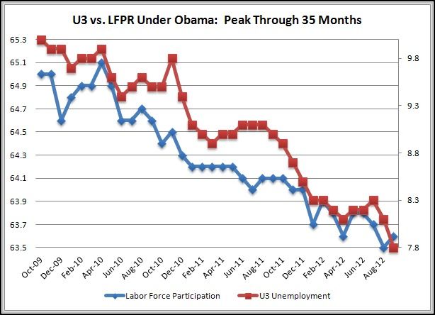
(LEFT) BLUE = Labor Force Participation As A Percent Of The Government Defined Work Force
(RIGHT) RED = Unemployment Rate As A Percent Of The Government Defined Available Labor ForceThe labor force participation rate is the number of available work force that are willing and able to work and either employed or actively looking for employment.