LOL... source not good enough, and attack the speaker rather than the message once you've been proven wrong. Typical approaches for the person who has no valid point to make.
But since you're too lazy or stupid to try to find information to rebut my chart, here's the Bureau of Land Management chart for corn prices, looking eerily similar to the one above, LOL. Good enough, or is the font not to your liking?
And my farm is in TN, which does nothing to change my point or my reasoning. Ideas are not dependent upon the identity of the speaker. Only morons think otherwise.
http://www.bls.gov/opub/btn/volume-1/images/1-17-chart1.png
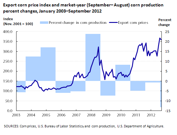
First off, with the juvenile name calling from afar. It doesn’t make you sound tough or educated. Bureau of Land Management for corn prices. Now that is funny. . The two charts have little in common. The second has no cost of production comparison. Your current chart shows price went up because production went down. In terms of inflation adjusted dollars corn is darn cheap. Corn was $2 in 1950.
So tell us, what quantity of Ag products do you raise in Tenn?