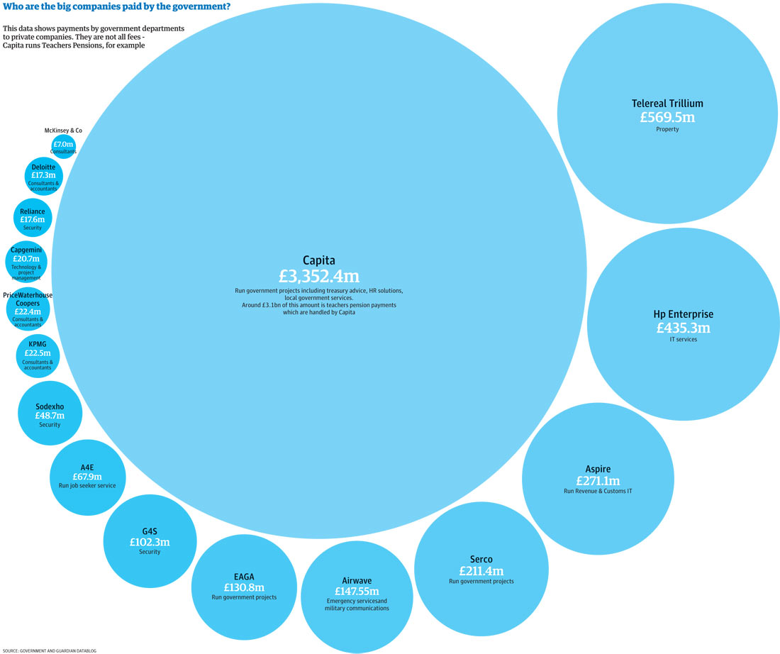
A great graphic. It could even be enhanced by color coding, say codes to indicate what type of good or service each company provides. That detail is given under the paid amount in text that is too small to read.
The listing on the right side is in order highest to lowest, as is the chart, highest to lowest.
It makes it very clear where the real money is spent.
No, cervine oculated, it isn’t clear at all. There are better ways of presenting that data.
A great graphic. It could even be enhanced by color coding, say codes to indicate what type of good or service each company provides. That detail is given under the paid amount in text that is too small to read.