It does. Unlike FRN, PG has a relatively stable (thousands of years) historic exchange value in terms of capital (land, other PM's, copper, steel, et c.,.). Its supply has increased at roughly the same rate as the human population which makes it uniquely suitable for indexing other commodities and currencies. Hence the vernacular term "Gold Standard".
"Then the third part of those graphs is the drop after 2000, which clearly represents the rise in gold price."
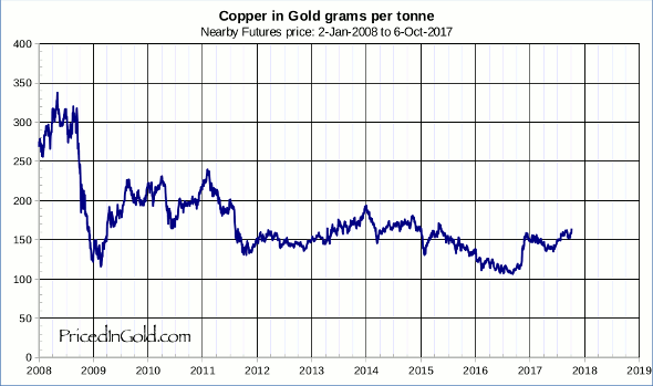
A wholly incorrect assertion. That part of the graph represents the massive dollar devaluation that has occurred over the past 10+ years. IOW - a big haircut in terms of absolute affluence for those who take their earnings, or hold assets denominated in USD. PG has risen only moderately vs. basic input commodities, which means it's not a bubble that we're seeing so much as a simultaneous collapse in purchasing power of the USD and Euro.
Beginning to wonder if THIS GUY is setting monetary policy at the Fed.