To: BuckeyeTexan
Like this maybe?
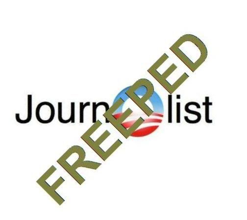
Needs work, this is a draft:
37 posted on
08/18/2010 2:19:57 PM PDT by
humblegunner
(Pablo is very wily)
To: humblegunner
Yeah, something like that. I’ve seen the “FREEPED” logo all by itself here on FR. I’ll see if I can find it. I think it’s red or blue and the font is similar to the one stamped over that Digg logo. I’ve also seen it stamped over the LA Times logo too.
It doesn’t have to be that particular JournoList logo. If you have better ideas, have at it.
39 posted on
08/18/2010 2:26:38 PM PDT by
BuckeyeTexan
(There are those that break and bend. I'm the other kind.)
To: humblegunner
40 posted on
08/18/2010 2:29:27 PM PDT by
FlashBack
('0'bama: "Katrina on a Global Level")
To: humblegunner; BuckeyeTexan
IMHO, the FREEPED should be about 1/5th the font size and just over the Obama O. To me the emphasis is in identifying the author as a member of JournOlist/Cabalist and to disparage/descredit that membership. The Freeper notation is secondary to that.
Thanks for the efforts.
TS
41 posted on
08/18/2010 2:40:05 PM PDT by
The Shrew
(www.wintersoldier.com; www.tstrs.com; The Truth Shall Set You Free!)
FreeRepublic.com is powered by software copyright 2000-2008 John Robinson