The one below fits better....

The one below fits better....
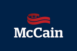
The banner looks like Donald Trump’s comb-over.
Good one! I just keep thinking about how much money was spent to come up with that “branding”.
He made it look like sh!tpaper, to remind us to wipe him off of the congressional rolls.
Why do they call it “branding” these days instead of “marketing”? Is there any useful difference between the words, aside from the fact that branding is more specific? I’ll bet these firms don’t just “brand”. They probably do other things normal ad agencies do.
As much as I like red, white, and blue the fact is anytime you print a red logo on a dark blue background it is hard to read; the read and blue seem to bleed into each other. Very poor design, imho. They needed to outline the logo in white.
I hope he paid big bucks for this.
They can try to repackage this guy as many times as they like. But any way you slice him, he’s still a Dim wannabe.
Support a true conservative, support J. D. Hayworth.
JDforSenate.com
McCain is trying to avoid townhall meetings this time around during his senate campaign. Things could get ugly.
You sir are hired.
Lord almighty, McShame uses essentially an Obama style logo with color scheme matching the last two democratic presidential runs. I am really beginning to hate the guy completely.
I’m going to check this out just to see how pitiful is the response to such obvious sicko marketing of a very stale product long past its use-by date.

The one below fits better....