Thanks Pissant.....speaking of the folds, many here have noticed the form 'type' does not distort or bend on many of the folds in the Bomford scan:
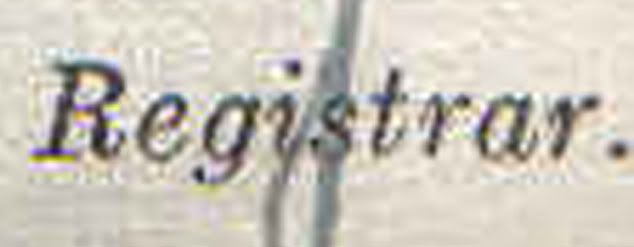
The Deputy Registrar type over the signature struck me as mighty peculiar ;)

If you take Deputy Registrar part of the Bomford B.C. and enlarge it up to 600 percent. You can clearly see the entire block outline of that particular layer in contrast to the surrounding pixels. This doesn't show the blocking that well, but you can clearly see it if you play around with it in photoshop. They tried to help out the "S". They just forgot the "D"(Which is not shown here..see above). They were on a limited timetable;)
Have at it......
Yes, I was just noticing that! It was one of the observations, though to the contrary point, that I had made about Orly's Kenya BC - that the text does, in fact, follow the contours - and that there are occasional typewriter spacing errors, e.g. the "Od" in Oduya, and the "M." in "M.H. Miller".
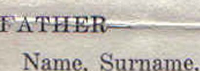
This Bomford doc looks like someone having fun with Microsoft Word templates and the Courier font.