 Other very good electoral analysis maps here: http://www-personal.umich.edu/~mejn/election/2008/ Other very good electoral analysis maps here: http://www-personal.umich.edu/~mejn/election/2008/
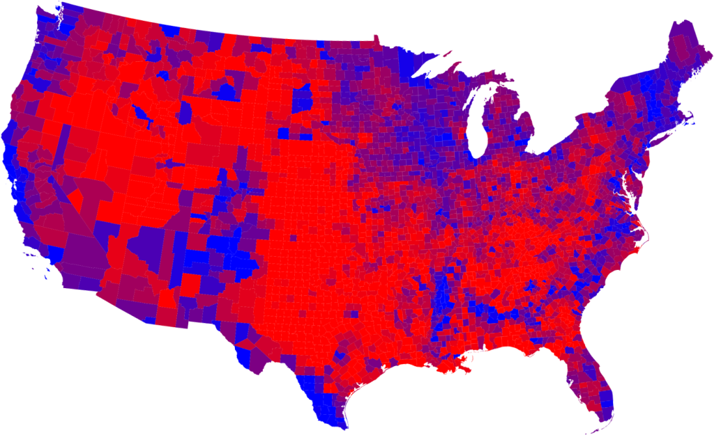
A bit distressing to see that map after Tuesday. It used to be a LOT more red. Comparing it with 2004, it’s similar to an MRI result that shows advancing brain death as the oxygenated, healthy red cells die over time, leaving only lifeless blue ones. Those that are purple appear to be those cells in a stage of dying off.
Only repeated, heavy doses of conservatism will revive this critically ill patient.