Free Republic
Browse · Search
News/Activism
Topics · Post Article

To: Swordmaker
That graph (and other's like it) led to what I now call the plateua between 1945 and 1976. At the time it looked like it might signal an end to the increase or even a decline.

But with out additional data, it now looks like a plateau in the middle of a 100 year increase.
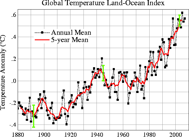
global warming temperature over time
28 posted on 03/23/2008 1:46:11 PM PDT by gondramB (Preach the Gospel at all times, and when necessary, use words.)
[ Post Reply | Private Reply | To 16 | View Replies ]


To: gondramB
That is a fascinating graphics, but probably not in the way you intended it. I would dearly love to learn the source. Clearly, it was not done by a physicist, a statistician or a climate-weather expert.

No true scientist would label such a temperature variation ordinate as an "anomally", since variation is the norm in both climate and weather, and has been forever. The only documented state within the topic of world temperature is constant change.

51 posted on 03/23/2008 2:57:43 PM PDT by Publius6961 (MSM: Israelis are killed by rockets; Lebanese are killed by Israelis.)
[ Post Reply | Private Reply | To 28 | View Replies ]

To: gondramB

The graph certainly looks authoritative and consequential - doesn’t it. Sorry, but this simplistic chart is great way to manipulate highly variable data and make it tell the story you want it to.

In a way it reminds me of a facetious suggestion to make airplane crash statistics to look better by making the calculations in incidents per flight-second rather than flight-hour.

Whoever made this graph was intending to perpetrate a hoax.


62 posted on 03/23/2008 3:41:12 PM PDT by TeaDumper
[ Post Reply | Private Reply | To 28 | View Replies ]

To: gondramB

Is that Tiros satellite data from 1880? I would not rely on Tiros data nuch before 1920.


82 posted on 03/23/2008 4:17:03 PM PDT by RightWhale (Clam down! avoid ataque de nervosa)
[ Post Reply | Private Reply | To 28 | View Replies ]

To: gondramB
Here is the same data presented by gondramB except this is monthly data over the past ten years.

Interesting how this chart can be have a moving average in it that is a straight line going up?


89 posted on 03/23/2008 4:55:33 PM PDT by JustDoItAlways
[ Post Reply | Private Reply | To 28 | View Replies ]

To: gondramB

It's a lot different from the three time adjusted US Temp data. Oh yeah...good luck QA/QC ing the data used for the Global Temperature average.

97 posted on 03/23/2008 9:01:02 PM PDT by I got the rope
[ Post Reply | Private Reply | To 28 | View Replies ]

Free Republic
Browse · Search
News/Activism
Topics · Post Article


FreeRepublic, LLC, PO BOX 9771, FRESNO, CA 93794
FreeRepublic.com is powered by software copyright 2000-2008 John Robinson