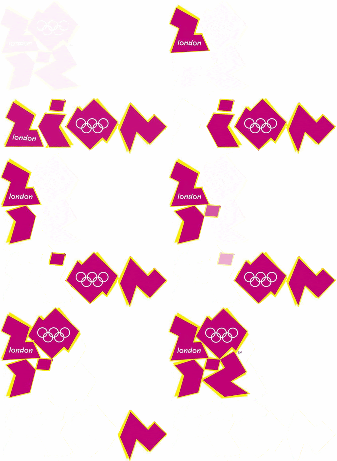
The2012 logo is to be filled with a range of images
Posted on 06/09/2007 8:13:09 PM PDT by bruinbirdman
The designers of the controversial London Olympics logo claim that they intended it as only the first part of an "evolving branding package".
The chunky, geometric shapes spelling out the date 2012 are supposed to be a "blank canvas" that will be filled with diverse images, photographs and sponsorship messages over the next five years, they say.

The2012 logo is to be filled with a range of images
Many of the images used to "infill" the shapes will be created by the public, who will be encouraged to enter competitions held every six months, with the winner chosen by online votes.
During the Games, each sporting venue will have a logo bearing a separate theme. Other versions will be displayed on London streets.
Official sponsors, who have the right to use the logo to market products and services, have been granted freedom to choose their own "infills".
Last week, Lloyds TSB, the first official 2012 sponsor, produced newspaper adverts featuring the 2012 logo coloured in its blue and green corporate colours. The only constants will be the "2012" shape, the Olympic rings and the word "London".
Sources close to the organisers denied that the adverse public reaction to the logo had forced either a rapid redesign or a decision to speed up the release of further details. They said the later stages of the logo plans could not be revealed last week because of fears that non-sponsors would plagiarise the "infill" design.
Lawyers advised managers that only the outline shape should be released, along with the four base colours: pink, orange, blue and green. It was pointed out that at last week's launch, Paul Deighton, the London 2012 chief executive, said: "The shape is constant, but it'll never be static or dull and will evolve over the next five years."
Originally, the "infill" concept was intended to be made public in several months, when the initial logo was well-established in the public eye. However, those plans have now been pushed forward and the first "infilled" logo may be released by Friday.
The sources said the vast publicity surrounding the logo - albeit much of it negative - had made the image so well-known that organisers could proceed to this next stage more rapidly than previously planned.
Jacques Rogge, the International Olympic Committee president, has described the design as "an indication of the dynamism, modernity and inclusiveness with which London 2012 will leave its Olympic mark".

No crescents is good sign.
How much did they get paid for this "evolving" POS?

See? You thought it was easy to polish a turd.
Next time you'll know

I know how to fix the issues for the London Olympic committee. Take those chunky symbols and put a burka around them, just like what’s happening all over Britain in everyday life. That will not only obscure poor design but also accuarately reflect the state of affairs in Northern Europe.


400,000 UK.
All publicity is good publicity, and this synthetic "controversy" accomplished exactly what they intended: People are talking, and in the end they will grace us with a new "Peoples' Logo" that everyone loves.
It was purely a scam for attention, and it worked. The Olympics are getting a bargain for this manipulative bulls--t.
You give them to much credit. It is a crappy design and they know it now. They should have spent a few pounds on a focus group before they released this to the public.

They paid someone a lot of money for this logo, too! LOL!

This is a good example of design by consensus, rather than using a good linear design process. Designs that evolve publicly disrupt everyone and tend to end up as inferior products.
looks like the copied the “ZOOM” children’s TV show.
Disclaimer: Opinions posted on Free Republic are those of the individual posters and do not necessarily represent the opinion of Free Republic or its management. All materials posted herein are protected by copyright law and the exemption for fair use of copyrighted works.