 >
> 2006 Senate election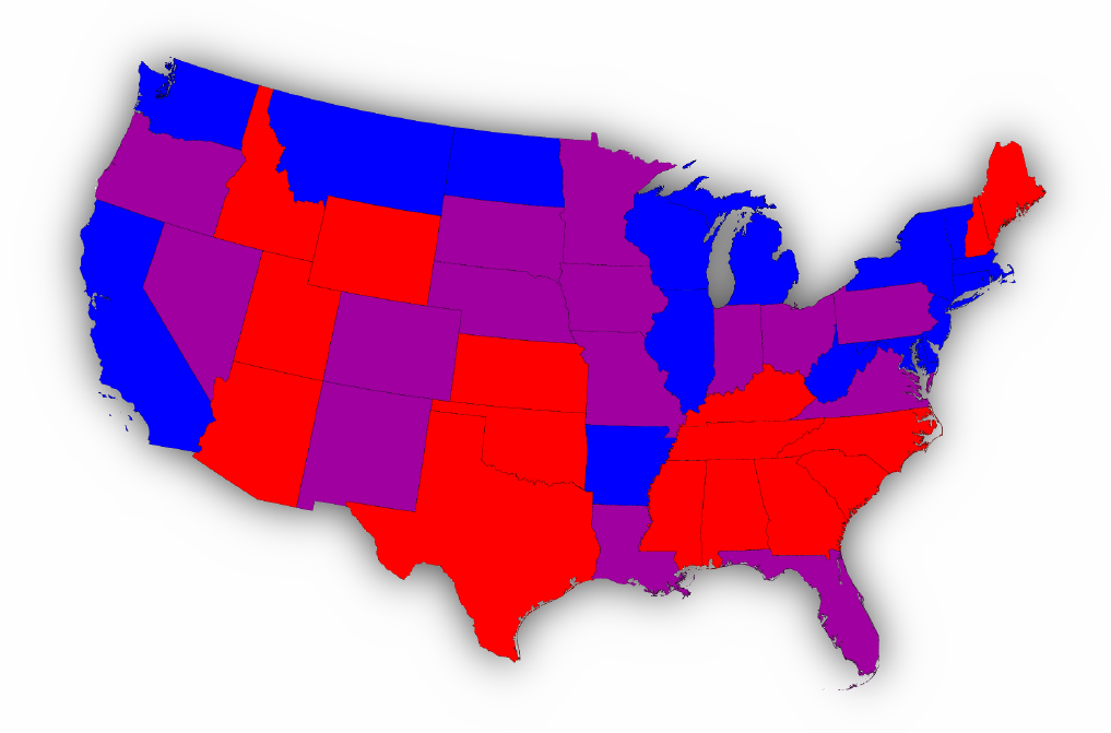
Posted on 12/09/2006 11:40:29 AM PST by Lorianne
House of Representatives
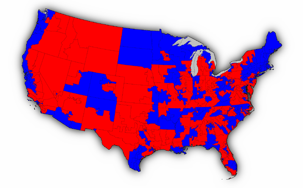
Many of us are familiar with the traditional election-night maps in which the fifty states of US are colored to indicate which political party won the largest number of votes in the state. Such maps are a helpful visual aid for representing the results of, for example, presidential elections, where the country votes state-by-state for the hopeful candidates. 2006 was not a presidential election year, but the country did vote in 2006 to elect a new House of Representatives. The appropriate map to represent the results of this election is a slightly less familiar one, the map of congressional districts. Here is what that map looks like for the 2006 election:
Map 1
In this map each congressional district is shown either in red or blue to indicate whether the district was won by the Republican or Democratic candidate respectively. (By an odd twist of recent electoral history, the accepted color scheme for the left- and right-leaning parties in the States is the opposite of what it is in most other countries, with red indicating right-wing not left.)
While maps like this are certainly interesting and useful, they are in some respects difficult to read. In particular, since the map above contains much more red than blue it gives the superficial impression that the Republican party dominated the election, when in fact the reverse is true – the Democrats won a significant majority of districts and with them the control of the House of Representatives. The source of the problem, as many people have pointed out, this is that the map fails to take account of the widely varying population densities of the various districts. This map shows the population density of the country, and it's easy to see that the population is far denser in some places (the light areas) than others (the dark areas):
Night Light Map
Because densely populated areas of the country tend to vote Democratic, the "blue" districts occupy smaller area on average, but they are nonetheless large in terms of numbers of people, which is what matters in an election. We can correct for this by making use of a cartogram, a map in which the sizes of districts are rescaled according to their population. That is, districts are drawn with a size proportional not to their sheer topographic acreage – which has little to do with politics – but to the number of their inhabitants, districts with more people appearing larger than districts with fewer, regardless of their actual area on the ground.
Here are the 2006 House election results on a population cartogram of this type:
Map 2
This map makes it clear that the numbers of people in Republican and Democratic areas are in fact not so far apart, and where the first map above makes it seem as though there is far more red than blue this one allows one to see how the votes fall in terms of actual population.
The actual number of Representatives in the House from each party however does not depend on how many people there are in each congressional district: by definition there is one representative per district. If one wants to be able to see at a glance which party has a majority in the House, therefore, a slightly different cartogram is appropriate, one in which we rescale the size of each congressional district to be the same. Here is such a cartogram for the 2006 election:
Map 3
The actual number of Representatives in the House from each party however does not depend on how many people there are in each congressional district: by definition there is one representative per district. If one wants to be able to see at a glance which party has a majority in the House, therefore, a slightly different cartogram is appropriate, one in which we rescale the size of each congressional district to be the same. Here is such a cartogram for the 2006 election:
> 2006 Senate election
True, "it's easy to see that the population is far denser in some places ... than [in] others ..." Truer words have not been said, with the possible exception of 2x2=4. Verily, in some places the population tends to be far more denser. And, just like in a septic tank, the largest [in this case, the densest] chunks tend to rise to the top.
I only see two.
There are more at the site.
The other maps at the site look like they were drawn by Salvador Dali. I got a headache looking at them.
okay
Slight problem: Arkansas did not have a Senate race in 2006.
My bad. :) They are interesting maps.
Uh oh.
I think it's showing the makeup of the Senate, including the 2006 results. Purple would be one Senator from each party.
Because densely populated areas of the country tend to vote Democratic, the "blue" districts occupy smaller area on average, but they are nonetheless large in terms of numbers of people, which is what matters in an election.
Nope, egghead, what matters is the demographics of the districts, not the gross population.
Try making cartograms using:
Adult population
Registered voters
Likely voters
Then maybe I'll pay attention to your "maps".
You don't have to be a statitician or geographer to understand how badly these cartograms distort the truth--their misleading nature is intuitive.
So your suggested new GOP slogan is "Vote for us, you pieces of shit"? Very catchy.
Nope. "Don't be so dense as to vote for the rats. Become smarter- and welcome."
What the map is showing is the distribution of US Senators -- red = 2 R US Senators, purple = 1 each, blue = 2 D US Senators (as of 2007).
Your images need work.
Disclaimer: Opinions posted on Free Republic are those of the individual posters and do not necessarily represent the opinion of Free Republic or its management. All materials posted herein are protected by copyright law and the exemption for fair use of copyrighted works.