

There is a great shot in the article; I can't seem to isolate it to post it. I hope you'll check it out.
Posted on 05/03/2006 5:29:00 AM PDT by Republicanprofessor
They are among the most popular paintings in the world but for decades they were starved of natural light and displayed in a building likened to an oversized garden shed.
Now, after six years of renovation work delayed by archaeological mishaps, Claude Monet's giant Water Lilies are finally back on display at the Orangerie museum in Paris, in a space restored to match the French impressionist's vision of how his work should be hung....
Monet donated the canvasses to France as a "spiritual testament" after the first world war, when he was beginning to lose his sight. They were conceived for the Orangerie's oval galleries with daylight coming through the ceiling and were first shown there in 1927.
(Excerpt) Read more at arts.guardian.co.uk ...
There is a great shot in the article; I can't seem to isolate it to post it. I hope you'll check it out.
Art Ping.
Let Sam Cree, Woofie, or me know if you want on or off the art ping list.

Just to make my point about Pollock and Monet. There is a similar dissolved, all over space in both of their works. Interestingly, while Pollock's work is called Lavender Mist, there is no purple in the piece. There is gray, a blue-green, a beige-pink, black and white. It reminds me of when snow is melting on a warm, foggy, March day in New England, and there is this all-over warm mist everywhere. Another bit of trivia is that Clement Greenberg, the critic, is the one who named this piece.
I think Pollock shows more activity and gesture, while Monet lets the gesture melt. I see Monet's late works as almost a meditation on life and death: to appreciate all that we have around us daily, the little changes in light, water, etc. Or perhaps that is just my philosophy of life and I just read it into the art.
I am also pinging the art education/appreciation list because this might be an interesting thread. (Or at least I am so hoping.)
Let me know if you want on or off this ping list. (There are some duplicates with the regular art ping list.)
I'd love to see these in person, but that would mean spending MY money in France.


It is truly enchanting and absorbing to see these in person. I see the MoMA ones every now and then and see something different each time.
But the great thing about the Orangerie is that the works were placed there immediately and with Monet's desire to have them there. Plus the new space and light sounds wonderful. I did see them there decades ago and was quite impressed.
I know, politically France is not so great with conservatives. But I'm willing to cut them some slack (and forgiveness) if I can see great art there. I'm not planning a trip there for a while; but I will return.
Thanks!! That's the image I wanted.
Thanks for the ping. I'd love to see that in person.
One of the chief differences between Monet and Pollock is that Monet was about light and Pollock was about color. I have yet to read a defense of representational art that talks about the complex organization of color that transcends itself to evoke light.
Then I will put NYC on my list of places to visit this year. France though... I'll think about it... AFTER Chirac is out.
I'm not sure if I understand my own question.
Actually, I disagree with you about Pollock. I don't think Pollock was much of a colorist at all. Clement Greenberg stated that and I agree. Rothko was about color, but Pollock was dealing with layers and energy. And he does a great job with that. I don't think he gave a great deal of thought to mixing just the right shade of a color, as did Rothko (and Monet, of course).
-white-center-(small).jpg)

I think color and light are intertwined; you can't recreate one without the other. The light on the pink clouds (reflected in the water above) cannot be separated from the color. Monet's grasp of both light and color was transcendental.
I often think of Rothko, Pollock, and Monet together. Some of you may be abashed at that thought; but Rothko's color, and shimmering planes, are also transcendental (to me, anyway). But it takes some thinking and seeing to come to that conclusion.
(By the way, if anyone wants to learn more about Pollock, Rothko, etc, check out my home page for mini "classes" on various art history periods. I hate to repeat myself too much in these threads....A few of the images on those threads have morphed into sexy babes instead of art, however...I don't know what to do about that....)
Perhaps I should be more specific: yes, color and light are mutually necessary, but I would make a distinction between transcendant paintings (where color evokes light) and immanent paintings (where color is an end in itself). Pollock's colors may not be as sexy as Rothko's but it is still used as color in itself rather than the complex combination of colors that evoke light (think Vermeer). Rothko's color may seem transcendent due to saturation of color and size of canvas but it still remains color-in-itself.
Perhaps I am not understanding what you are getting at, but isn't that what pointillism was all about? Discrete dots of pure colors organized in such a way as to evoke a representation of the play of light on objects?
Wow! Thanks for the ping.
Monet's Lilies at MOMA were a surprisingly anticlimactic experience for me. I did not care for the space at all. Perhaps I should give them another chance. On the other hand, I surprised myself (and other patrons) by being overcome with tears in front of Van Gogh's "The Starry Night" and Chagall's "I and The Village".
Ditto.
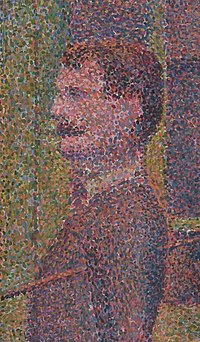
Pointillism was concerned with the latest scientific understanding of light theory; however it concerns itself more with sense data rather than the complexity of thought and perception that goes into laying several different colors of varying tones and values and next to each other to evoke light. Seurat, like many of his contemporaries, got away from that. You can see that even as they pursued the "fugitive effects of light" they also started becoming more color-bound.
Some of the problems I have with pointillism are that the draftsmanship seems too static, and the lack of any really dark hues gives the pieces a shallow quality. The darker hues would give more meaning to the lighter ones if you will. I enjoy the study that Seurat did for the Island of La Grande Jatte in New York much more than the "Masterpiece" that hangs in Chicago. I also infinitely prefer Seurat's drawings to anything he ever painted.
Disclaimer: Opinions posted on Free Republic are those of the individual posters and do not necessarily represent the opinion of Free Republic or its management. All materials posted herein are protected by copyright law and the exemption for fair use of copyrighted works.