AG, it does NOT confirm anything regarding global climate trends at this temporal resolution! The Vostok ice core is in
Antarctica; it is not a global temperature record. The only way that you can have a global temperature record from regional proxy data is to create a combined/merged data set. That's the issue with these various analyses. If you look at the figure I posted, you can see that the Esper curve, which is
only for tree-ring data in the Northern Hemisphere, is much noisier than the merged datasets from the other groups. Furthermore, continental Antarctica is actually cooling, whilst the Antarctic Peninsula, the coast, and the adjacent ocean waters are warming. That in part explains why the rise at the end of the Vostok record is not as dramatic as the instrumental surface data which appears at the end of the figure above. Finally, Vostok ice core proxy temperatures are based on the 18O/16O ratio in precipitation, which does not respond immediately to global temperature changes (the effect on the ratio has to propagate through the atmosphere and ultimately effect the isotopic composition of the water vapor that becomes rain, snow, and ice).
This mistake is made over and over and over again, and it's one of the ways that the "hockey stick" critics have tried to assess his data. Regional temperature variability is always going to be greater than a merged data set, because the peaks in one region may be partially or completely canceled by troughs in another region.
However, note something: the location of the warm and cold periods still generally coincides with the other records. The only point of dispute regards the magnitude of the warmest peaks around 400 and 900-1000 AD compared to the end of the ice core record.
By the way, at what year exactly is the Vostok ice core temperature record considered to end?
"The second graph (Data 3) is for the past 200 years. This time period includes all of the Industrial Revolution which began in the mid-1800s. The start of the Industrial Revolution marked the beginning of the large-scale exploitation of fossil fuels. The small dip in temperature in the early 1800s was caused by volcanic eruptions which reduced the amount of sunlight reaching the Earth's surface. CO2 inflection points are visible at around 1860, 1950 and 1975. After 1958, the data are from annual air measurements, not ice core proxies, and are therefore of higher quality."

So if this is correct, then in your plot the temperature data only goes to 1958. In which case the temperature rise over the last 40 years, which would increase the endpoint of your graph by at least 0.25 C, isn't shown.
It's useful to look at Vostok data over 400,000+ years, because on that scale what happens in 500-1000 years is integrated by the climate system into the precipitation signal. But in the modern timeframe, the Antarctic is partially decoupled from processes happening in the rest of the world.
As a final aside, Mann's multi-proxy data record includes six ice-core records, but does not include the Vostok ice core data. I have no idea if Vostok was excluded because of what I said above, or for other reasons.
But in the modern timeframe, the Antarctic is partially decoupled from processes happening in the rest of the world.
LOL, that's one interpretation.
The other is global temperture dependance upon CO2 concentration is grossly overstated hence a perceived decoupling on the part of those wedded to a CO2->Global Warming dependancy.
CO2-Temperature Correlations
- "(1) correlation does not prove causation,
(2) cause must precede effect, and
(3) when attempting to evaluate claims of causal relationships between different parameters, it is important to have as much data as possible in order to weed out spurious correlations.
***
Consider, for example, the study of Fischer et al. (1999), who examined trends of atmospheric CO2 and air temperature derived from Antarctic ice core data that extended back in time a quarter of a million years. Over this extended period, the three most dramatic warming events experienced on earth were those associated with the terminations of the last three ice ages; and for each of these climatic transitions, earth's air temperature rose well in advance of any increase in atmospheric CO2. In fact, the air's CO2 content did not begin to rise until 400 to 1,000 years after the planet began to warm. Such findings have been corroborated by Mudelsee (2001), who examined the leads/lags of atmospheric CO2 concentration and air temperature over an even longer time period, finding that variations in atmospheric CO2 concentration lagged behind variations in air temperature by 1,300 to 5,000 years over the past 420,000 years."
[ see also: Indermuhle et al. (2000), Monnin et al. (2001), Yokoyama et al. (2000), Clark and Mix (2000) ]
- "Other studies periodically demonstrate a complete uncoupling of CO2 and temperature "
[see: Petit et al. (1999), Staufer et al. (1998), Cheddadi et al., (1998), Raymo et al., 1998, Pagani et al. (1999), Pearson and Palmer (1999), Pearson and Palmer, (2000) ]
- "Considered in their entirety, these several results present a truly chaotic picture with respect to any possible effect that variations in atmospheric CO2 concentration may have on global temperature. Clearly, atmospheric CO2 is not the all-important driver of global climate change the climate alarmists make it out to be."
Global warming and global dioxide emission and concentration:
a Granger causality analysis
http://isi-eh.usc.es/trabajos/122_41_fullpaper.pdf
- "We find, in opposition to previous studies, that there is no evidence of Granger causality from global carbon dioxide emission to global surface temperature. Further, we could not find robust empirical evidence for the causal nexus from global carbon dioxide concentration to global surface temperature."
By the way, at what year exactly is the Vostok ice core temperature record considered to end?
149 years prior to 2000, so the temperature chart provided above from Muller's site includes additional studies all using 1950 temp as the relative baseline. Muller also includes current measured temperatures up around '95 in his chart set to complete the record.(may need to hit leftclick->show picture to see the graphics)
But then we can always fill in the last 140 years with direct surface temperature deviations so VOSTOK is hardly required at that point they merely need to be adjusted to the relative 1950 base line he uses:
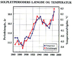 Graph of solar activity versus climate
From Friis-Christensen, E., and K. Lassen, "Length of the solar cycle: An indicator of solar activity closely associated with climate," Science, 254, 698-700, 1991.
So, if I'm reading this right, the plotted (air?) temperature is flucating rapidly (and strongly!) recently, but WITH A TREND CENTERED ON 0.0 CHANGE; but the CO2 readings are simply and slowly rising.
In other words, average global air temperatures ARE NOT BEING affected by the measured CO2 changes, but demonstrable CO2 CHANGES have taken place.
---...---
Now, an open question to class ....
What is the predicted CO2 change that the global warmist eco-enviro's fear?
AS I inderstand their previous "crisis summaries", we have already gotten about 1/3 through the maximum rise in CO2 they fear.
But we've not seen any massive increase in temperatures. (Yet - temps (if they've risen - and that is debatable) are only up 1/2 -1/3 of a degree.)
Why then are they predicting so large a temp increase, if so little is already changed?
Do their computer models add a fudge factor to continue "ramping" temperature UP after the CO2 levels are stable? Or are they predicting massive failures of everything (global folloding, drought, feast, and famine) based on the 1 degree rise?
What's the source of the temperature data in that graph?
The Friis-Christensen, E., and K. Lassen study uses average Northern Hemphisphere surface temperatures.
The webpage containing the graph is: http://web.dmi.dk/solar-terrestrial/space_weather/
it doesn't show the warming since the mid-1800s (which is 0.6-0.8 C in the surface instrumental record)?
You can always look at link I provided above to Muller's History of Climate introduction, which presents the full range of data he used right up to 1999 or thereabouts.
Beginning in the early 1900s, the climate of the world began to warm. This is evident in Figure 1-1, which shows the average Earth surface temperature from 1880 through 1999. The temperature is an area-weighted average over the land and ocean compiled by the National Oceanographic and Atmospheric Administration, using an averaging technique devised by Quayle et al. ; see also . In the plot, "zero" temperature is defined as the temperature in 1950. The fine line shows the monthly temperatures; the thicker line shows the 12 month yearly averages.

But in the modern timeframe, the Antarctic is partially decoupled from processes happening in the rest of the world.
Actually I was wrong on the 2400 year data set, I didn't look to verify and assumed Vostok Data, after checking Muller's introduction, the actual data set used was
Data from a kilometer long core taken from the Greenland glacier, as part of the Greenland Ice Sheet Project "GISP2" , are shown in Figure 1-2. For comparison purposes, the zero of temperature scale for this plot was set to match that of the previous plot. For historical interest, we marked some events from European history.
