Posted on 10/05/2021 9:27:52 AM PDT by Fractal Trader
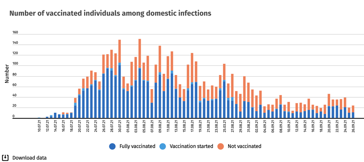
I like to check Iceland's data from time to time. They are honest in their reporting. Blue is vaccinated, Orange is unvaccinated.
Iceland notes that most of the orange represents kids who were infected by their vaccinated household members.
ping
Your twitter post source provides no source link nor context for the graph to gauge the data...
I’d be interested to see the source of your data.
I google and binged for an authoritative source, but was unable to find anything other than this quote. While this woman is a news broadcaster, that doesn’t guarantee that she is correct.
That’s why I said interesting, if true. Wanted to put it out as food for thought. Maybe this can be proved in Israel or elsewhere.
Understood....just pointing out the twitter posters lack of documentation....grain of salt and all that.
:>)
It’s that darned volcano’s fault!
Drooling all over the countryside for almost 6-months...
It’s a confusing graph with the numbers stacked like that. Three separate lines would have worked better, in my opinion.
I HATE those graphs. Too hard to figure out, maybe that is why everyone is using them.
Disclaimer: Opinions posted on Free Republic are those of the individual posters and do not necessarily represent the opinion of Free Republic or its management. All materials posted herein are protected by copyright law and the exemption for fair use of copyrighted works.