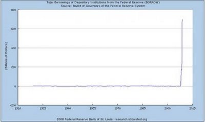
It seems to me that every chart of anything I’ve seen lately looks like a hockey stick. I guess you could say the amount of charts looking like hockey sticks is growing exponentially.