Posted on 08/25/2005 10:40:59 AM PDT by finnman69
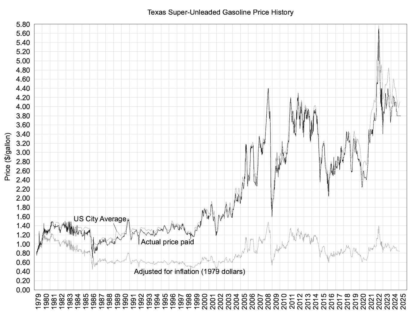
Gasoline Price History The following plot shows how much I paid for each gallon of gas I bought over the past 26 years or so. The data has a somewhat varied pedigree. Most of the purchases from 1979-1982 were in the Rio Vista/Fort Worth, Texas area. From late 1982-1983 was from College Station/Rio Vista about equally. From 1984-1987 was a Rio Vista/College Station/Houston mix and from 1987 on has been mostly Houston with a little Fort Worth thrown in. Just about everything pre-1984 was full service and everything since has been self-serve. Every tank shown was "super" unleaded (92-93 octane).
Three curves are shown on the plot. The upper, black curve shows the actual price paid for each gallon. The lower curve is the data adjusted for inflation using April, 1979 as the datum. That is, the data in this curve has been adjusted to "April 1979 dollars". The "CPI-All Urban Consumers for all items less energy" was used to adjust the data using monthly average data interoplated to the actual purchase dates. The CPI data is from the U.S. Bureau of Labor Statistics. The third, faint line, shows the average price for the entire U.S., again from the BLS.
The plot contains data from 996 fill-ups.
It looks like gasoline has just about doubled plus a little in the past 20 years. My pay has over quintupled in the same time period. The vehicles I drive (SUV's) get better mileage than those I drove 25 years ago (also SUV's).
I think that chart really only points out inflation.
Disclaimer: Opinions posted on Free Republic are those of the individual posters and do not necessarily represent the opinion of Free Republic or its management. All materials posted herein are protected by copyright law and the exemption for fair use of copyrighted works.