
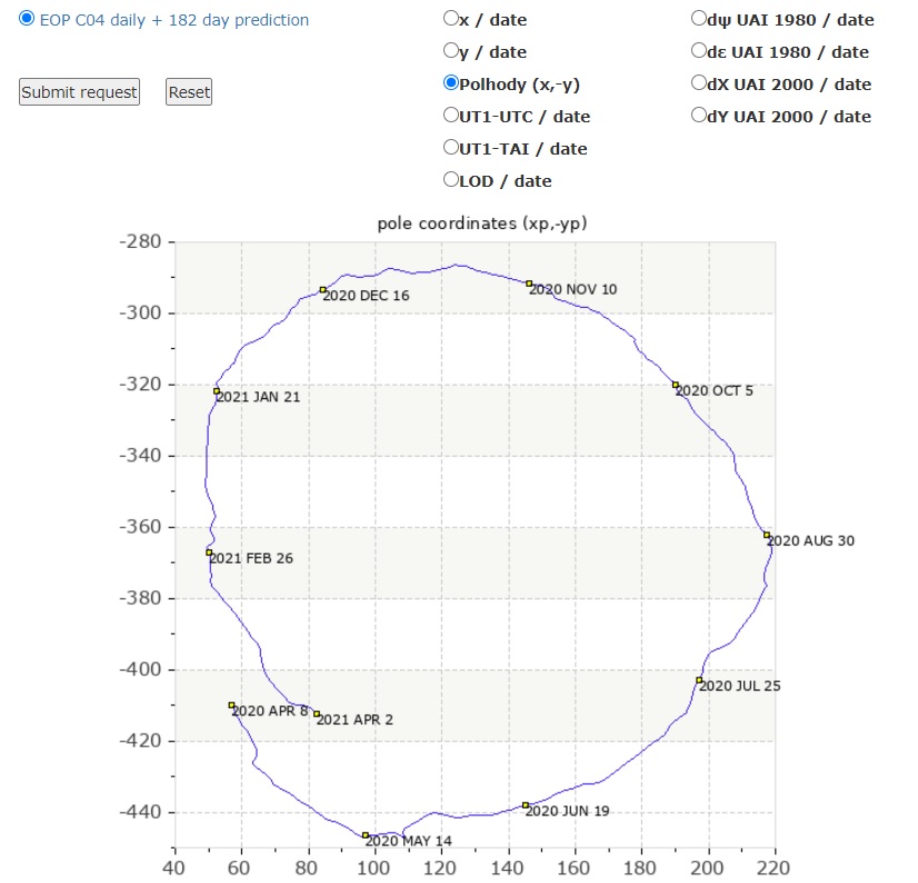
Your illustration is nice but only tells part of the story. The true precession cycle takes 11,300 years. It consists of the grand loop, which your animated drawing shows, that takes 11,300 years. The smaller loops are described by the data in the table.
In other words the precession consists of the poles inscribed tens of thousands of small circles on the edge of the huge loop it inscribed across the heavens. Then there is the spiral up and down motion through our arm of the Milky Way, but we’ll save this for another time. As an aside, all of this motion has definitive impacts on global temperatures.

Fascinating graph. Makes me wonder if the earth will eventually flip over.