
Posted on 09/29/2013 7:45:05 AM PDT by Kaslin
Where do you stack up in the distribution of income within the United States?
We can help you answer this question using the data that the U.S. Census Bureau has collected on the total money income earned by individual Americans, as well as for the families and households into which Americans gather themselves!
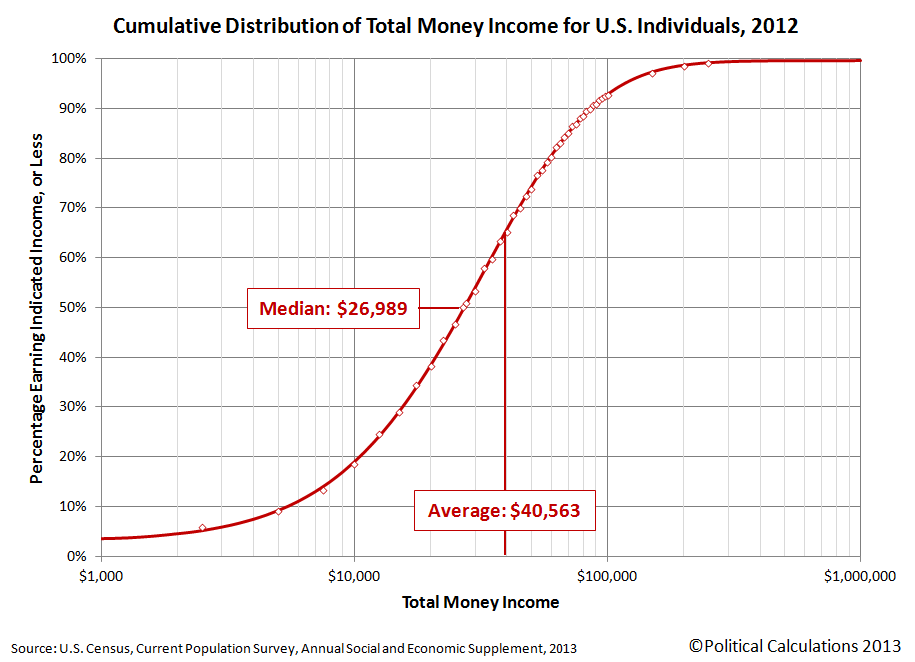
If you're a visual person, we'll first present the information graphically in chart form and then we'll present a tool where you can get a more precise estimate of what your percentile ranking is within each of these groups. In the charts below, first find the income that applies for you on the horizontal axis, then move directly upward to the curve that defines the cumulative distribution of income. Once you've found your place on S-shaped curve in each chart, look directly to the vertical scale on the left hand side of the chart to determine your approximate U.S. income percentile ranking.
The first chart applies for individual Americans, which includes all people Age 15 or older who received some kind of money income on a regular basis, say from full-time jobs or Social Security benefits, but not for things like food stamps, health benefits, housing assistance, capital gains, etc.. With that being the case, the Census Bureau's data tends to understate the amount of effective income that Americans have, especially at the lower end of the income spectrum:
Our second chart shows how the distribution of income changes when individual Americans are grouped into families, which the Census Bureau defines as being a "group of two people or more (one of whom is the householder) related by birth, marriage, or adoption and residing together":

Our third chart is similar to the families chart, but here, individual Americans have been grouped into households. Households are different from families in that they consist of "all the people who occupy a housing unit", regardless of whether they are related to each other by birth, marriage or adoption, or not, and even a single individual who lives alone is considered to be a distinct household.

So much for the pictures - let's see where you really fit in! To find out where you, your family or your household ranks among each of these categories, just enter your personal income, your family's income, which includes the incomes of your spouse and other family members who live with yout, and also the combined income of just the people who live within the walls of the same household that you do. We'll do some quick math and provide a more precise estimate of the percentage of all American individuals, families and households that you outrank given the incomes you enter.
And as a bonus, we'll also break down the numbers for your Individual income to tell you how you compare to your fellow male and female Americans.
It all starts below! (Unless you're accessing this article through a site that simply republishes our RSS news feed, in which case, you should click through to our site to access a working version of our tool....)
Click for tool here.
For our readers who live outside of the United States, you can still get in on the action if you convert your income from your local currency into U.S. dollars first!
The default data we've presented in the tool above represents the average total money income of U.S. individuals, families and households for the year you select. Oh, and as a bonus, you can also see where you would have fit in the U.S. income distributions we've modeled going back to 2011 by selecting your year of interest (other years may appear in the future!...)
In the tool above, your percentile ranking indicates the percentage of Americans who either share your income or earn less than you do. As such, it tells you what percentage of the population you're above in the income-earning food chain.
For example, a percentile ranking of zero would indicate that you are at the very bottom end of the American income spectrum, while a percentile ranking of 100 indicates that you are effectively at the very top end. A percentile rank of 50.0 would indicate that you're within spitting range of being the middle of all Americans, as our tool should be able to place most people within 0.2% of their actual percentile ranking.
Finally, if you're looking for the income data for this year, please note that the U.S. Census Bureau will report the data it collects for this year sometime in September of next year. The delay isn't all bureaucratic - they send out the surveys for income in March of each year, just as or after most Americans fill out their income taxes for the previous year so their income figures are still fresh in their memories, and then it can take the Census Bureau's statisticians up to six months to sort it all out and make some kind of coherent sense of it all!
U.S. Census Bureau. Current Population Survey. Annual Social and Economic (ASEC) Supplement.Table PINC-01. Selected Characteristics of People 15 Years and Over, by Total Money Income in 2012, Work Experience in 2012, Race, Hispanic Origin, and Sex. [Excel Spreadsheet]. 17 September 2013. Accessed 17 September 2013.
U.S. Census Bureau. Current Population Survey. Annual Social and Economic (ASEC) Supplement.Table PINC-11. Income Distribution to $250,000 or More for Males and Females: 2012. Male. [Excel Spreadsheet]. 17 September 2013. Accessed 17 September 2013.
U.S. Census Bureau. Current Population Survey. Annual Social and Economic (ASEC) Supplement.Table PINC-11. Income Distribution to $250,000 or More for Males and Females: 2012. Female. [Excel Spreadsheet]. 17 September 2013. Accessed 17 September 2013.
U.S. Census Bureau. Current Population Survey. Annual Social and Economic (ASEC) Supplement.Table FINC-07. Income Distribution to $250,000 or More for Families: 2012. [Excel Spreadsheet]. 17 September 2013. Accessed 17 September 2013.
U.S. Census Bureau. Current Population Survey. Annual Social and Economic (ASEC) Supplement.Table FINC-01. Selected Characteristics of Families by Total Money Income in: 2012. [Excel Spreadsheet]. 17 September 2013. Accessed 17 September 2013.
U.S. Census Bureau. Current Population Survey. Annual Social and Economic (ASEC) Supplement.Table HINC-06. Income Distribution to $250,000 or More for Households: 2012. [Excel Spreadsheet]. 17 September 2013. Accessed 17 September 2013.
U.S. Census Bureau. Current Population Survey. Annual Social and Economic (ASEC) Supplement.Table HINC-01. Selected Characteristics of Households by Total Money Income in: 2012. [Excel Spreadsheet]. 17 September 2013. Accessed 17 September 2013.
Something to ponder while Barry Hussein Soetoro picks your pocket.
My first job was at a branch store of a clothing retailer. The store lost money every year, EXCEPT they year I started working there.
For turning a profit, the manager was reamed and fired; the store was immediately closed, and all of us laid off. It was SUPPOSED to lose money, as a corporate write-off/write-down; the manager knew that, but made money anyway.
I learned a lot from that experience
It is a semi logrimic graph.
Well the store I ran always made good profit, it was the bread and butter store, The owner had, at that time seven other stores that mine was, building, remodeling or just plain covering their high rent and service fees. So there was plenty of places for the owner to “lose” his profits.
I’m with you brother....can’t seem to get ahead with prices going up, gas, food and healthcare to follow soon!!!
That only means you are in the middle, problem is being in the middle is not what it used to be. Middle class is being hammered right now!!!
I think Obama”care” is going to drop me out of the middle of the curve. I think that is the intent.
I believe that is the intent....to force us onto the gov. dole!!!
.
Once on the dole, you won’t vote to stop it. Permanent voting block for dems and establishment Reps
I knew I wasn’t going well but, wow, I am not doing well.
Good for you.
I don’t fall anywhere on that graph. My income isn’t “distributed” to me. I have to go out and earn it.
For the first, and possibly the only time in my life, I am in the dreaded 1%.
Well, the chart pretty well shows what we all know, that there is a big gap between wealthier and the rest.
What amazed me was the difference in “individual” and “family”. My wife stays home to raise our family. So when I saw the “individual” I thought “I’m doing okay”. Then when I looked at the “family” (being the sole breadwinner) I was thinking “Oh - no wonder I don’t feel rich!”
It says a lot about life in America when both mom & dad need to be out making money to pay the bills (and taxes), leaving the older kids to their own devices all day. I can’t even imagine being a single parent trying to do it all.
Me too, self employed. Been on poverty income for the last 4 years, since the Real Estate crash. Now I am purposely slowing down my business as I approach the end of the year, as I cannot take sending any more money to DC. Isn't that sad? I am purposely not working hard, so as not to pay more in tax to this totally corrupt and dangerous government.
We are BO's number one enemy. Not Iran, not Syria not the muslim brotherhood or any other foreign government, the R's are the only one he will NOT negotiate with. I do not appreciate being accused of being a terrorist, having B???s strapped onto me, good lord I have to leave it blank in case they are monitoring everything I say or do. I am sure they are monitoring all of us, we are the terrorists now!
Nice pun. Obviously, the charts show not the income "redistributed" by the government, but the distribution of income across income groups using cumulative distribution function (CDF) which is a pretty typical statistical binomial distribution in the shape of the S-curve (not to be confused with the "growth S-curve").
In other words, to paraphrase, "it's not personal, just statistics." ;-)
Why is that surprising? It would make sense that a median and average "individual" / single income would be much smaller than the one of the group income ("family" or "household," which includes single people and people living together but not married, i.e. filing individual income tax returns).
In addition, the "individuals" generally include [very] young and [very] old, who tend to have much lower incomes.
More interesting is the difference between "family" and "household" income, but it could be explained by inclusion of single households as well as usually poorer households with young unwed mothers and/or fathers.
Also, the charts show income but not necessarily wealth, as some wealthy people are afforded the flexibility of structuring their finances as not necessarily take certain "income" in that particular year, for tax or other considerations.
As you can see from [the steepness of] the curves, [depending on where you live] a lot more of the "families" and "households" should fall into the middle class (somewhere between 25%-30% and 90%-95%) than "individuals" (somewhere between 40%-50% and 90%-95%). It makes sense.
F. Scott Fitzgerald: "Let me tell you about the very rich. They are different from you and me."
Ernest Hemingway: "Yes, they have more money."
Disclaimer: Opinions posted on Free Republic are those of the individual posters and do not necessarily represent the opinion of Free Republic or its management. All materials posted herein are protected by copyright law and the exemption for fair use of copyrighted works.