Posted on 07/18/2017 9:59:01 AM PDT by servo1969
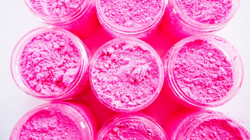
I can show a brighter pink. I can show a more saturated pink. But I can't show you this pink. Not quite. (I reached out to Anish Kapoor's studio twice for comment; I didn't get any response.) Colour grading this video was a nightmare! I've got as close as I can to the real colour - Stuart gave me a small pot of the pigment to take home! - but it's just not quite there. It's not more saturated, it's not brighter, it's just... a tiny bit more pink, somehow.
More about Stuart Semple and his pigments: https://www.culturehustle.com/ [that's his store, we overloaded Stuart's personal web site, http://www.stuartsemple.com, within a few minutes...!]
(Excerpt) Read more at youtube.com ...
“I smell pink”
Usually, if someone offers to show you their pink, say ‘no thanks.’
Looks like an old Walmart photo that has faded.
There are also problems properly representing some aqua colors on a color monitor for the same reason.

Hmmm,depends.
Isn’t this a retread of a years-old story about a designer that trademarked a particular hue of pink and sues people or makes them spend outrageous amounts of money to settle claims if they use a similar hue?
Disclaimer: Opinions posted on Free Republic are those of the individual posters and do not necessarily represent the opinion of Free Republic or its management. All materials posted herein are protected by copyright law and the exemption for fair use of copyrighted works.