Posted on 06/07/2013 12:04:33 PM PDT by Ernest_at_the_Beach
I was aware of this story yesterday, but I didn’t like the original plot, (see at the end of this post) since use of straight line linear trends doesn’t accurately reflect the reality of the observation data. While it is often hard to find any reality in climate models, linear trend lines mask the underlying variance. Today, Dr. Spencer has produced a graph that I feel is representative and very well worth sharing, because it does in fact convey an EPIC FAIL speaking directly to the accuracy of an ensemble of climate models. – Anthony
Dr. Roy Spencer writes:
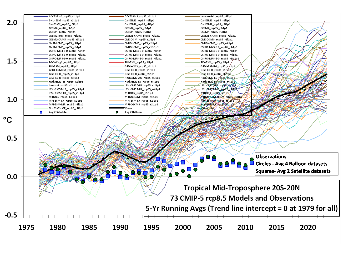
In response to those who complained in my recent post that linear trends are not a good way to compare the models to observations (even though the modelers have claimed that it’s the long-term behavior of the models we should focus on, not individual years), here are running 5-year averages for the tropical tropospheric temperature, models versus observations (click for full size):
In this case, the models and observations have been plotted so that their respective 1979-2012 trend lines all intersect in 1979, which we believe is the most meaningful way to simultaneously plot the models’ results for comparison to the observations.
In my opinion, the day of reckoning has arrived. The modellers and the IPCC have willingly ignored the evidence for low climate sensitivity for many years, despite the fact that some of us have shown that simply confusing cause and effect when examining cloud and temperature variations can totally mislead you on cloud feedbacks (e.g. Spencer & Braswell, 2010). The discrepancy between models and observations is not a new issue…just one that is becoming more glaring over time.
Read his essay here: http://www.drroyspencer.com/2013/06/still-epic-fail-73-climate-models-vs-measurements-running-5-year-means/
==============================================================
Here is the linear plot from Dr. Spencer’s post yesterday. He writes:
Courtesy of John Christy, a comparison between 73 CMIP5 models (archived at the KNMI Climate Explorer website) and observations for the tropical bulk tropospheric temperature (aka “MT”) since 1979 (click for large version):
Rather than a spaghetti plot of the models’ individual years, we just plotted the linear temperature trend from each model and the observations for the period 1979-2012.
Note that the observations (which coincidentally give virtually identical trends) come from two very different observational systems: 4 radiosonde datasets, and 2 satellite datasets (UAH and RSS).
If we restrict the comparison to the 19 models produced by only U.S. research centers, the models are more tightly clustered:
Now, in what universe do the above results not represent an epic failure for the models?
I think we need a plot to show the correlation of gov,t spending on models vs their increased temp outputs.
Have at it.
Now THAT would be enlightening...
Or maybe the number of studies vs. the govt. spending.
Not following this topic as much as I have in the past....have added a few to what I had on the list in the past ....and dropped some.
Drop a comment in the thread if you want dropped or added.
One of the best climatologists. The official climatologist of EIB, I believe.
I believe his stuff.
Good presentation but most of the Progressive audience will ignore it because it conflicts with their religious beliefs.
(PhysOrg.com) -- Sunspot formation is triggered by a magnetic field, which scientists say is steadily declining. They predict that by 2016 there may be no remaining sunspots, and the sun may stay spotless for several decades.
The last time the sunspots disappeared altogether was in the 17th and 18th century, and coincided with a lengthy cool period on the planet known as the Little Ice Age.
Some glaciers are receding in Alaska, some are growing.. and that’s the eyewitness report from the land up North.. we’re headed out of Victoria for San FRan. :-]
Once again the global warmer’s graph starts in the mid-late 1970s at the end of four decades of known and acknowledged global cooling.
If they started their graph in the 1930s when the temperatures were very similar to today a line drawn directly from the mid-late 1930s temps to today’s temps would be almost exactly flat.
It’s hard to sell massive new taxes and government regulations when the temps are almost exactly the same at 80 years ago.
So you personally checked out some of them?
Inasmuch as I agree with him, Dr. Spencer does not do a good job of citing sources here. I want to use this material, but it does me no good without it.
We made it into Glacier Bay for my first time. They was coming and going... according to NPS literature.
Ironically or I should say sadly, even this cruise line has allowed itself to be hornswaggled, one display has the NRDC in small print as a partner in saving the environment. The nrdc is one of the worst abusers, they also have an susan komen walk for cancer cure onboard tomorrow.
You can’t escape even on a cruise from lefty causes.. I guess I’ll just go and put some ice on it. There’s plenty up here. :-)
Disclaimer: Opinions posted on Free Republic are those of the individual posters and do not necessarily represent the opinion of Free Republic or its management. All materials posted herein are protected by copyright law and the exemption for fair use of copyrighted works.