Posted on 04/14/2014 8:08:29 PM PDT by Tolerance Sucks Rocks
Recent weeks have led to a fairly significant drop in stock valuations, with many expert analysts struggling to figure out exactly why it’s happening. You’ll hear them cite the weather, or market overreaction, or any number of reasons for why stocks have seen their share prices reduced and why they’ll be rebounding in the near-term.
What they won’t show you on mainstream financial channels is what’s really happening behind the scenes.
Forget about all the minute-by-minute noise for a moment and take a look at the following chart. It gives a very simple overview of earnings growth trends for stocks listed on the S&P 500 on a quarterly basis.
Last year saw what analysts would call fairly robust growth, and they had no problem citing these numbers for evidence of economic recovery.
We’re curious what they’d call it now, considering this chart shows a massive collapse in earnings per share growth across the board.
Pay close attention to that yellow line, which indicates growth (or lack there of) for the first quarter of 2014. According to Zero Hedge this is a Flashing Red Warning as earnings growth plunges to its lowest levels since 2012:
(Excerpt) Read more at freedomoutpost.com ...
PING!
Thanks to our cave-in, doormat Republicans such as Boehner and McConnell, the Obamanation Transformation of the United States of America is now the Law of the Land.
FORWARD!
HOPE! and CHANGE!
Yahoo Finance George Soros' 5 Largest Buys Amid Bet Against the S&P 500>
Awhile back Soros put a lot into JCP; I don't know where he stands with it now but it's languishing around 7 last I looked. Maybe a big pump and dump.
FORWARD!
Lock and load
Well, gee, now I’m gonna sleep soundly tonight /sarc
But, but I just read on Yahoo that tax revenue is up so that means the economy is booming.
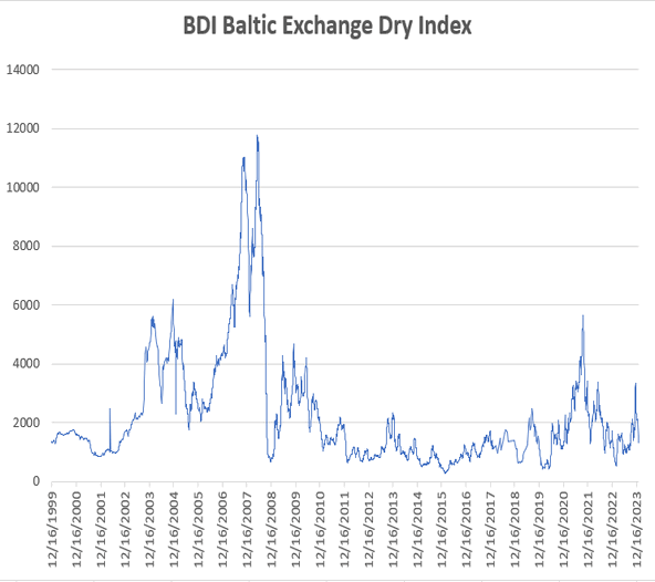
Just keep your eye on the Baltic Dry Index. It tells you everything you need to know about the shape of things.
Earnings growth estimates are generally fairly conservative at the start of earnings season. About 2/3 of firms will beat estimates on average and actual results for the S&P500 average about 4% higher at the end of earnings season than at the start. Add that in to chart and for 1Q14 and it is not that dire.
It usually is around this time of year. I wonder why??? ;-)
Isn’t BDI cratering?
Bookmark.
“Isn’t BDI cratering?”
Yes its all bad.
It’s about where it was thru most of 2012.
Is that good or bad?
“It’s about where it was thru most of 2012.”
“Is that good or bad?”
Its gone way down from 2012. Last time I looked at it the first quarter of this year it was horracious. So I would say thats bad.

Look at the chart. Look at the red line then look at the blue line. Like I said its way down from 2012.
Just in case you don’t understand the BDI it measures the cost of moving goods from one place to another. The lower the demand the lower the price. In this instance a low number is bad.
I’m still confused.
Here’s the data by month:
1/01/12 - 1738
2/01/12 - 638
3/01/12 - 763
4/01/12 - 934
5/01/12 - 1152
6/01/12 - 904
7/01/12 - 1013
8/01/12 - 878
9/01/12 - 698
10/01/12- 777
11/01/12- 1000
12/01/12- 1077
TODAY - 970
To me it looks like 7 months in 2012 this index was lower than it is now.
I don’t know what to tell you. I’m looking at the chart its cratered.
Don’t take my word for it call your broker and ask him.
Disclaimer: Opinions posted on Free Republic are those of the individual posters and do not necessarily represent the opinion of Free Republic or its management. All materials posted herein are protected by copyright law and the exemption for fair use of copyrighted works.