Free Republic
Browse · Search
News/Activism
Topics · Post Article

Skip to comments.

Global warming deniers mount ad campaign calculated to outrage (and it's working!)
Los Angeles Times ^ | May 4, 2012 | Dan Turner

Posted on 05/06/2012 7:36:50 PM PDT by Zakeet

click here to read article


Navigation: use the links below to view more comments.
first previous 1-2021-4041-59 last
To: Zakeet

ROTFLOL


41 posted on 05/07/2012 12:10:47 AM PDT by TigersEye (Life is about choices. Your choices. Make good ones.)
[ Post Reply | Private Reply | To 1 | View Replies]

If Dan Turner is so ignorant as to think Hitler was a Christian it’s no wonder he’s bought into the man-made global warming hoax.


42 posted on 05/07/2012 12:17:56 AM PDT by Hayride
[ Post Reply | Private Reply | To 40 | View Replies]

To: Zakeet

The Earth’s “average temperature” has NOT increased for 12 years.

Atmospheric CO2, on the other hand, has increased for 12 consecutive years.

According to some studies, CO2 is at its highest point in thousands of years.

But, whoops, global temperature is not increasing.


43 posted on 05/07/2012 12:18:10 AM PDT by zeestephen
[ Post Reply | Private Reply | To 1 | View Replies]

To: Publius6961
That temperatures have been rising is fact. Not a single informed person or actual scientist has ever denied that.


44 posted on 05/07/2012 12:29:24 AM PDT by TigersEye (Life is about choices. Your choices. Make good ones.)
[ Post Reply | Private Reply | To 40 | View Replies]

To: srmorton

Great comment!


45 posted on 05/07/2012 1:01:39 AM PDT by preacher (Communism has only killed 100 million people: Let's give it another chance!)
[ Post Reply | Private Reply | To 24 | View Replies]

To: TigersEye

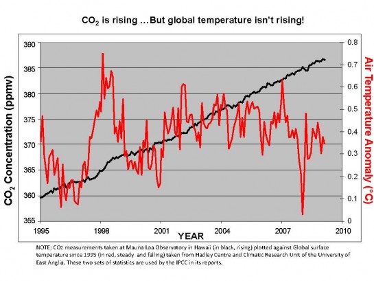
Just because it’s a(nother) pet peeve of mine: No credible scientist would/should publish a graph like that. The origin is surpressed for the CO2 scale, which wildly distorts it (i.e., makes the slope look a lot steeper than it actually is). Imagine the same data plotted on a scale that ranges from 0 to 400, and it would look almost flat (i.e., not scary “we’re all going to die” steep).


46 posted on 05/07/2012 4:06:06 AM PDT by Moltke (Always retaliate first.)
[ Post Reply | Private Reply | To 44 | View Replies]

To: prolusion
From the article, “which isn’t a “belief,” but a well-established scientific theory ...”

And from the Scientific Method, that which is established is fact, that which is believed is theory.

Indeed. They can't even lie correctly.

47 posted on 05/07/2012 4:38:11 AM PDT by TheOldLady
[ Post Reply | Private Reply | To 13 | View Replies]

To: Moltke
It depends on what time scale you look at...

...and what part of the atmosphere you look at...


RSS Temperature Lower Troposphere (TLT) - Brightness Temperature Anomaly – 1979 to Present


UAH Lower Atmosphere Temperature Anomalies – 1979 to Present


RSS Temperature Middle Troposphere (TMT) – Brightness Temperature Anomaly – 1979 to Present


Temperature Troposphere / Stratosphere (TTS) – Brightness Temperature Anomaly – 1987 to Present


Temperature Lower Stratosphere (TLS) - Brightness Temperature Anomaly – 1979 to Present

...but the one thing that is abundantly clear is that there hasn't been any warming since 1998 and there isn't anything unusual about the warming since The Little Ice Age and it hasn't gotten as warm as it was before TLIA and on average the global temperature at its warmest during the last 10 million years is very very cold compared to what came before that. So peeve away! :-)

48 posted on 05/07/2012 11:54:50 AM PDT by TigersEye (Life is about choices. Your choices. Make good ones.)
[ Post Reply | Private Reply | To 46 | View Replies]

To: Moltke
The origin is surpressed for the CO2 scale,...

What does that even mean, "the origin is suppressed?" What 'origin?' How is it 'suppressed?' It shows CO2 levels juxtaposed with global temperatures over the same time frame. Whether the graph compresses the data or not it still shows temperatures falling and CO2 rising over the same period of time.

49 posted on 05/07/2012 12:02:05 PM PDT by TigersEye (Life is about choices. Your choices. Make good ones.)
[ Post Reply | Private Reply | To 46 | View Replies]

To: digger48; Zakeet; Artcore; TigerLikesRooster; landsbaum; Signalman; NormsRevenge; steelyourfaith; ..
Skeptics threaten the Gravy Train....

See this thrread:

Dinosaur gases 'warmed the Earth'

50 posted on 05/07/2012 1:54:21 PM PDT by Ernest_at_the_Beach
[ Post Reply | Private Reply | To 4 | View Replies]

To: Ernest_at_the_Beach

Sure looks like the Heartland Institute will remain a target of ridicule. Meanwhile we witness the extended sea ice build up in the bearing straights and Arctic Ocean in general.


51 posted on 05/07/2012 2:27:13 PM PDT by Marine_Uncle
[ Post Reply | Private Reply | To 50 | View Replies]

To: TigersEye
What does that even mean, "the origin is suppressed?" What 'origin?' How is it 'suppressed?'

Origin = see the first paragraph of the following:

Cartesian_coordinate_system

To wit, the "zero" point. It is not shown in the graph I commented on, hence it is suppressed. As my further comment pointed out. Which leads to a distortion of the perceived significance of the slope of the curve. Learn some basics before trying to piss on my leg.

52 posted on 05/07/2012 4:19:24 PM PDT by Moltke (Always retaliate first.)
[ Post Reply | Private Reply | To 49 | View Replies]

To: Moltke

The zero point of CO2 in the atmosphere would have been sometime during the planet’s formation. You really won’t accept a graph unless it goes back 4.5 billion years?


53 posted on 05/07/2012 4:36:43 PM PDT by TigersEye (Life is about choices. Your choices. Make good ones.)
[ Post Reply | Private Reply | To 52 | View Replies]

To: TigersEye
The zero point of CO2 in the atmosphere would have been sometime during the planet’s formation. You really won’t accept a graph unless it goes back 4.5 billion years?

No! You are totally missing my point, as it were. It's a question of *how* data is represented. There is *no* time scale involved in the graph, or this argument.

When the origin is surpressed for the ordinate (the 'y' axis), it does not give a proper - or exaggerated - perspective of the data. Read my original post again. The graph looks like there is a steep - significant - rise of CO2 over the provided timescale (abscissa, or 'x' axis).

*If* the ordinate values properly started at 0 and went to 400 or so, it would be obvious that the rise of CO2 is actually very slight.

The general public is often mislead by such representation of data. It makes it look much more significant than it actually is. How can you not understand this?

54 posted on 05/08/2012 10:50:50 AM PDT by Moltke (Always retaliate first.)
[ Post Reply | Private Reply | To 53 | View Replies]

To: Moltke
I don't know what graph you're looking at but the one I posted in post #44 has a time scale from 1995-2009. The only purpose of it is to show that CO2 increased over that time period and that temperature did not. That is true.

Peeve away!

55 posted on 05/08/2012 11:36:12 AM PDT by TigersEye (Life is about choices. Your choices. Make good ones.)
[ Post Reply | Private Reply | To 54 | View Replies]

To: Moltke

FWIW ‘surpressed’ is not a word even though you keep using it.


56 posted on 05/08/2012 11:40:14 AM PDT by TigersEye (Life is about choices. Your choices. Make good ones.)
[ Post Reply | Private Reply | To 54 | View Replies]

To: TigersEye

Wow. You still don’t get it.

And you also do not seem to understand that my original post was not a criticism directed at you but at whoever made up that graph. (The *content* of which I have no issue with - just the way it is *represented*.)


57 posted on 05/08/2012 12:06:59 PM PDT by Moltke (Always retaliate first.)
[ Post Reply | Private Reply | To 55 | View Replies]

To: Moltke
I do get it. The graph has one purpose and one point to make that CO2 was rising while temperature was not. It was not intended to convey that the rise was significant only that there was a rise. When a graph is made to put on a poster to be shown in front of an audience, as that one was, it is common to compress the axes in relation to each other so that the key point is in contrast enough to be easily seen. There was no attempt to mislead anyone.

Your point is moot because you are arguing against a premise that is non-sequitur to the intention behind the graph.

58 posted on 05/08/2012 12:29:22 PM PDT by TigersEye (Life is about choices. Your choices. Make good ones.)
[ Post Reply | Private Reply | To 57 | View Replies]

To: higgmeister

As I’m always saying to Mrs. Liberty: Ya gotcher ipsos, ya gotcher factos, and ya gotcher QEDs....


59 posted on 05/08/2012 12:38:09 PM PDT by Cyber Liberty (Obama considers the Third World morally superior to the United States.)
[ Post Reply | Private Reply | To 38 | View Replies]


Navigation: use the links below to view more comments.
first previous 1-2021-4041-59 last

Disclaimer: Opinions posted on Free Republic are those of the individual posters and do not necessarily represent the opinion of Free Republic or its management. All materials posted herein are protected by copyright law and the exemption for fair use of copyrighted works.

Free Republic
Browse · Search
News/Activism
Topics · Post Article

FreeRepublic, LLC, PO BOX 9771, FRESNO, CA 93794
FreeRepublic.com is powered by software copyright 2000-2008 John Robinson