Skip to comments.
Trump mulls changing official unemployment rate
washingtonexaminer.com ^
| 1/29/17
| Sean Higgins
Posted on 01/29/2017 8:54:53 AM PST by ColdOne
click here to read article
Navigation: use the links below to view more comments.
first previous 1-20, 21-40, 41-44 last
To: ForYourChildren
From here, "Contrasts and Comparisons Between the Great Depression and Now" http://www.financialsense.com/contributors/asha-bangalore/2011/08/23/contrasts-comparisons-between-great-depression-and-now
They have the following:

Source: Labor Force, Employment, and Unemployment 1929-39, Estimating Methods, Monthly Labor Review, July 1948

Notice the "Source" in the first graph, which a typical Great Depression type graph. It says, "Estimating Methods." This is what has always been done to get the Great Depression unemployment numbers.
The second graph, does not say that it uses the same "Estimating Methods." But it is using some sort of "Broad Measure of Unemployment," not a U-3 or U-6 type measure. In the article, it does say the "Broad Measure of Unemployment" (the blue line) includes "folks who are working part-time but want full-time jobs and those marginally attached to the labor force." So this is an attempt to gain apples to apples comparison.
41
posted on
01/29/2017 12:49:27 PM PST
by
ForYourChildren
(Christian Education [ RomanRoadsMedia.com - Classical Christian Approach to Homeschool ])
To: ForYourChildren
Shadowstats tries to make the best apples to apples comparison. http://www.alt-market.com/articles/2711-this-chart-shows-just-how-bad-unemployment-is-today-compared-to-the-great-depression
Here is their unemployment graph using a Broad Measure with estimating methods as close as possible to the Great Depression estimating methods.
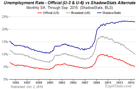
The blue line unemployment rate for the last 8 years is MUCH worse that the great depression.
42
posted on
01/29/2017 12:54:26 PM PST
by
ForYourChildren
(Christian Education [ RomanRoadsMedia.com - Classical Christian Approach to Homeschool ])
To: ROCKLOBSTER
The labor force has shrunk that much since Obama and the RATs destroyed the economy. These are able bodied people who stopped looking for work. The 95 million are far more than that.
To: ForYourChildren
The percentage of working-age men actually employed is the lowest since the great depression.
That’s apples-to-apples. It’s really that bad out there, and it’s been almost entirely ignored by the press and the national accounting establishment. Purposely, I believe.
44
posted on
01/29/2017 9:53:39 PM PST
by
Eisenhower Republican
(Supervillains for Trump: "Because evil pays better!")
Navigation: use the links below to view more comments.
first previous 1-20, 21-40, 41-44 last
Disclaimer:
Opinions posted on Free Republic are those of the individual
posters and do not necessarily represent the opinion of Free Republic or its
management. All materials posted herein are protected by copyright law and the
exemption for fair use of copyrighted works.
FreeRepublic.com is powered by software copyright 2000-2008 John Robinson