Skip to comments.
Wages of Stagnation
www.townhall.com ^
| Tuesday, September 26, 2006
| By Bruce Bartlett
Posted on 09/26/2006 5:20:47 AM PDT by .cnI redruM
click here to read article
Navigation: use the links below to view more comments.
first previous 1-20 ... 41-60, 61-80, 81-100, 101-107 last
To: 1rudeboy
I agree. That's why engineering is the best bet, not gender studies. Or in any of the hard sciences. But the universities like liberal arts majors inlcuding gender studies. Those programs have very little overhead compared to any techniocal or practical degree. Get lots income by shoving as many students as will fit into the biggest lecture hall.
101
posted on
09/26/2006 8:15:30 PM PDT
by
doc30
(Democrats are to morals what and Etch-A-Sketch is to Art.)
To: Mase; A. Pole
See my chart and then tell us why employers covering the rapidly increasing cost of benefits for their workers should not be included in the equation? Do you have a source for that chart? I'd be interested in seeing the numbers on which it is based. In any case, the indices in the chart are evidently not corrected for inflation. That would explain why the red line labelled "Wages and Salary" appears to be going up while every measure of real wages that I've seen shows them to have stagnated or gone down the past few years. For example, the following graph shows median and mean (average) wages for full-time, year-round workers:

The actual numbers and sources are at http://home.att.net/~rdavis2/ftyrinc.html. As can be seen, the median and mean wages of full-time, year-round working men are down over the past several years and the median wages of working women is stagnant or slightly down. Only the mean wage of working women is slightly up. In any case, the graph shows that neither the median nor the mean gives the whole story. The steep increase in the mean male wage from 1992 to 2000 was accompanied by a much smaller increase in the median male wage. In fact, one of the more interesting items that I noticed in the chart is that the median wages of working men has been pretty much stagnant since 1973 despite a 21 percent increase in the mean wage.
Of course, your chart also shows total compensation and per capita income (evidently not corrected for inflation). I assume that total compensation includes wages, payments made to the government for Social Security and unemployment insurance, medical and pension benefits, options and other forms of compensation. While these are all valid items to look at, they do not apply equally to all workers. Few workers, especially low-wage workers, receive options and many low-wage workers do not receive medical insurance. Social Security contributions have not gone up and I'm not aware of any other mandatory payments that have. Hence, it's valid to look at total compensation but one must look at pure wages to get an idea of how those who receive only wages (and mandatory government benefits) are doing.
This point applies even more to per capita income. I assume that a major component of this is investment income. Few low-wage workers are receiving much of anything in investment income. In any case, it's not the topic of this thread ("Wages of Stagnation"). Hence, I'd appreciate it if you could provide a source for your chart so that I can check the numbers and see what they include.
To: Mase; remember
Hi Mase,
You NYT chart is so oversimplified as to be meaningless. Post #102 by remember is a better analysis of wages. Your chart cites 'income.' What's this 'income' and how as it calculated? Simple averages are basically rubbish because, with respect to wages, are a very skewed number. And what is this source of income? Is it strictly wages, the basis of this thread? Or is it total compensation paid by employers? Total compensation has risen, especially with the employer contributions to health care for many companies, but total compensation is not representative of real, take home wages. What people see is the bottom line on their paychecks. If that number is going up slower than inlfation, then people re being paid less. The total compensation number is a bogus game played by some employers. I was once offered a job for $30K and the HR guy tried to spin it like it was $45K because of benefits. I told him either my salary was really $45K or it wasn't and I turned it down. I didn't want to work for such a blatant spin-meister.
Remember's post is a better reflection of reality because it at least has mean and median wages while your chart has this loose 'income' value. Simpley listing even an average value is skewed because one high income earner weighs more heavily in the calculation than typical income earners. The best way to show the data would be to show a histogram with income levels vs number of income earners and plot that against time. It would be a 3D plot, but it would tell the whole story. And don't get me started on the lack of geographic breakdown, too. National averages are even worse measures of income. Until I see somethings like those, remember's post is a far, far more accurate portrayal of what's really going on. The statistics in the NYT piece is basically garbage.
And good for you that you made money in real estate stocks. To bad a good chunk of the population doesn't have money to invest in the stock market. I looked at your lint to the Flow of Fund info and, again, it's very misleading. It is simple, raw numbers that do not reflect what's really going on. It's simple totals. It says that there's about $20 trillion in houshold real estate and almost $40 trillion in financial assets. That is not distributed evenly in the population. For example, someone like Donald Trump will have a disproportionate share of financial assests and real estate compared to the average person. But there are lots and lots of people without real estate and who's only investment would be a 401(k), which is money they need for retirement, not something they can readily use today.
And what wealth is created by the service sector? It's not producing anything. I'm not devaluing it's role in the economy. There is a defininte transfer of wealth into the service sector, but unless some type of value is added, it is not creating new wealth. It is merely exploiting wealth that already exists. Manufacturing is one way of creating wealth. Natural resources is another. Adding value to a product is a third. And, as others have cited, software is a value added product and helps to create wealth.
And when you refer to home ownership at an all time high, what do you mean? Total number of homeowners? Sure that's gone up. There are more simgle parent and single people buying homes, so it not directly with past numbers. Comprehensive information would include a breakdown of type of houshold as well as the proportion of each type of household with respect to population. Simple, raw numbers are the best way to be misleading without lying.
103
posted on
09/27/2006 6:16:57 AM PDT
by
doc30
(Democrats are to morals what and Etch-A-Sketch is to Art.)
To: remember
I'm curious: what is your story? Are you any relation to the rdavis that used to post here? Is that your blog? Who does the calculation of your numbers?
To: remember
The source of the chart is from an article in the WSJ by Stephen Moore from the Club for Growth. The chart is no longer available but the article, with a subscription, can be found here:
Wages of Prosperity.
If that link won't work please try here.
From the article:
But the reality is that the economic well-being of the American family has never been better -- as measured by income, consumption, and wealth (see nearby chart). And these gains have continued over the past five years, despite the recession and stock-market crash of 2000-01. The typical household today has a disposable income higher than any other time in history, and when taking into account all forms of benefits that workers now receive, compensation to workers is about 27% higher in real terms than 25 years ago. Workers earn in less than four days a week what their parents earned in five, and they make in three days on the job what their grandparents earned in five.
The driving force behind these income gains has been the stunning increased productivity of American workers. Between 2000 and 2004, the average annual rate of productivity of workers has risen by 3.6% per year and by 5.5% per year in the manufacturing sector -- the fastest rate of improvement in 30 years.
Hence, it's valid to look at total compensation but one must look at pure wages to get an idea of how those who receive only wages
I agree that it's valid but the driving force of increased compensation is the rapid increase in the cost of healthcare. From the same article:
From the article:
The real cost-driver is, of course, health care. Over the past 20 years, employer medical insurance costs have doubled relative to the average wage. If health costs are not somehow contained in the years ahead, EPF estimates that the share of total compensation consumed by health costs will double from 12% today to 25% by 2015. If that comes to pass, virtually all salary hikes for typical workers will be completely crowded out by higher employer health-care costs.
How many workers receive only wages and no benefits? I've not seen any accurate statistics quantifying this. My guess is that this occurs in the lowest quintile of wage earners. If so, the question becomes how upwardly mobile are the lowest 20%. The data show that the majority of these earners do not remain in the bottom quintile for long. There has been (and will always be) a certain percentage of this quintile who never manage to move up and will require government assistance for their entire lives. Some people would suggest that a greater redistribution of wealth will alleviate this problem. After spending $2 trillion over 40 years in the war on poverty I'd say those people are wrong.
Most Americans are doing very well as Moore points out in his article
Between 1980 and 2005 the share of Americans who are workers/stock owners has doubled from 25% to 52%. Since 1980, shareholder wealth has increased by about $15 trillion. Those wealth gains used to be hoarded by the wealthy, but thanks to innovations like 401(k) plans and IRAs, the wealth gains from the American bull market have been further democratized and the dividends have been spread more widely to middle-class America.
Don't you think real incomes for Americans would have to rise for the percentage of working Americans invested in the stock market to double?
The middle class seems to be doing just fine as is evidenced by this graph:
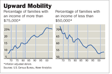
From another WSJ article: The Great American Dream Machine.
- The Census data from 1967 to 2004 provides the percentage of families that fall within various income ranges, starting at $0 to $5,000, $5,000 to $10,000, and so on, up to over $100,000 (all numbers here are adjusted for inflation). These data show, for example, that in 1967 only one in 25 families earned an income of $100,000 or more in real income, whereas now, one in six do. The percentage of families that have an income of more than $75,000 a year has tripled from 9% to 27%.
- But it's not just the rich that are getting richer. Virtually every income group has been lifted by the tide of growth in recent decades. The percentage of families with real incomes between $5,000 and $50,000 has been falling as more families move into higher income categories -- the figure has dropped by 19 percentage points since 1967. This huge move out of lower incomes and into middle- and higher-income categories shows that upward mobility is the rule, not the exception, in America today.
- The middle class has not been "shrinking" or losing ground, it has been getting richer. For example, the Census data indicate that the income cutoff to be considered "middle class" has risen steadily. Back in 1967, the income range for the middle class (i.e., the middle-income quintile) was between $28,000 and $39,500 a year (in today's dollars). Now that income range is between $38,000 and $59,000 a year, which is to say that the middle class is now roughly $11,000 a year richer than 25 to 30 years ago.
- The upper-middle class is also richer. Those falling within the 60th to 80th percentile in family income have an income range today of between $55,000 and $88,000 a year, which is about $24,000 a year higher than in 1967.
In fact, one of the more interesting items that I noticed in the chart is that the median wages of working men has been pretty much stagnant since 1973 despite a 21 percent increase in the mean wage.
The NY Times, Washington Post and the unions who run the E.P.I. have also made this same point. Alan Reynolds addressed their concerns in an article titled: Yes, A Rising Tide.
According to the Bureau of Labor Statistics (BLS), the "usual median earnings of full-time wage and salary workers" amounted to $262 a week in 1980 and $638 in 2004.Translated into 2000 dollars, using the deflator for personal consumption, the median weekly wage rose to $589.40 in 2004 from $503.09 in 1980 -- an increase of 17.2 percent. Real wages have always fallen when oil prices surged (such as 1981 and 1990), yet the real median wage for 2005 nonetheless remained higher than any previous year except 2004.
There were three recessions between 1980 and 2004, so comparing figures for the start and end of that period cannot show what happened when. The real median wage in 1991 was $510.68, for example, so the increase by 2004 was 15.4 percent, or 1.2 percent a year. That sounds OK to me, but nobody knows whether it was slow or fast. We can't compare that 1.2 percent annual gain with the past because this data series began in 1979.
Because of major demographic changes, movements in the median wage do not necessarily describe what happened to "typical" workers over a decade or more. The median was mathematically diluted by the addition of millions of low-wage immigrants. Adding so many more people at the bottom of the income ladder redefined the midpoint (median). Yet it probably had no effect on those previously considered "typical" (middle-income) except to hold down their cost of fast food or home and lawn care.
Any measure of wages alone understates increases in living standards by excluding health and retirement benefits. The BLS index of real compensation includes benefits. It rose to 118.7 in 2004 from 89.5 in 1980 -- a gain of 32.6 percent. Even total compensation excludes income from investments, including the statistically invisible returns inside IRA and 401(k) plans. All measures of earned income likewise exclude the underground cash economy, legal and illegal. And they exclude huge transfer payments, including the Earned Income Tax Credit and Social Security.
The other thing I like about Reynolds is that he asks those who argue that real wages have stagnated since 1973 how this could be possible when real per-capita consumption has been increasing since 1973.
From Unreal Wages:
Despite the problems price indexes have in coping with new and better products, measured real consumption per capita has nonetheless doubled since 1973. Unless the rich could somehow consume unlimited numbers of houses, cars, shirts and steaks, it is difficult to imagine how each American's real consumption could have doubled if real salaries had actually been unchanged
Reynolds again from Yes, A Rising Tide
The broadest measure of living standards is what consumers spend. Real consumption per person rose from $14,816 in 1980 (in 2000 dollars) to $25,816 in 2004 -- an unprecedented gain of 74.2 percent. Can anyone really believe that all those new superstores, malls and restaurants built since 1980 have been catering to just the richest 10 percent? Can anyone believe the top 10 percent really bought nearly all of those new houses, cars, computers and steaks? The whole idea that America has experienced a 25-year stagnation in typical living standards is as fanciful as the phony statistics deployed to defend it.
105
posted on
09/27/2006 9:40:38 AM PDT
by
Mase
To: 1rudeboy
I'm curious: what is your story? Are you any relation to the rdavis that used to post here? Is that your blog? Who does the calculation of your numbers? No, I have no knowledge of any rdavis who used to post here. However, that is my website at http://home.att.net/~rdavis2/budget.html (I wouldn't really call it a blog). Most of the numbers there come directly from the given sources. All other numbers come from simple calculations that can be done in a spreadsheet containing the original numbers. I don't do any of the calculations by hand.
To: Mase
Hence, it's valid to look at total compensation but one must look at pure wages to get an idea of how those who receive only wages I agree that it's valid but the driving force of increased compensation is the rapid increase in the cost of healthcare. From the same article:
The real cost-driver is, of course, health care. Over the past 20 years, employer medical insurance costs have doubled relative to the average wage. If health costs are not somehow contained in the years ahead, EPF estimates that the share of total compensation consumed by health costs will double from 12% today to 25% by 2015. If that comes to pass, virtually all salary hikes for typical workers will be completely crowded out by higher employer health-care costs.
How many workers receive only wages and no benefits? I've not seen any accurate statistics quantifying this. My guess is that this occurs in the lowest quintile of wage earners. If so, the question becomes how upwardly mobile are the lowest 20%.
I did find some data on this in the Employee Benefits Survey done by the Bureau of Labor Statistics. The following table summarizes that information:
PERCENT OF ALL WORKERS IN ALL PRIVATE INDUSTRY RECEIVING LISTED BENEFIT

1999 2000 2003 2004 2005 2006  Percent of All Workers...
---- ---- ---- ---- ---- ----  ----------------------
  21   19   20   21   21   20  Participating In Defined Benefit Pension
  36   36   40   42   42   43  Participating In Defined Contribution Plans

  36   34   37   38   39   37  Participating In Short-term Disability Benefits
  53   52   53   53   53   52  Participating In Medical Care Benefits
  67   68   78   76   76   75  With Medical Care Required To Contribute Toward
                                 Cost Of Single Coverage
  75   77   79   77   77   76  With Access To Paid Holidays
  79   80   79   77   77   77  With Access To Paid Vacations
  53             59   58   57  With Access To Paid Sick Leave
   6    4   14   14   14   15  With Access To Employer Assistance For Child Care

Source: Bureau of Labor Statistics, Employee Benefits Survey,
        online at http://data.bls.gov/cgi-bin/surveymost?eb
As can be seen, just over half of workers in the survey had Medical Care Benefits. Of those who do, about three-quarters pay some portion of the premium for single coverage. Hence, there appears to be a significant portion of workers who have no health coverage provided by their work.
Between 1980 and 2005 the share of Americans who are workers/stock owners has doubled from 25% to 52%. Since 1980, shareholder wealth has increased by about $15 trillion. Those wealth gains used to be hoarded by the wealthy, but thanks to innovations like 401(k) plans and IRAs, the wealth gains from the American bull market have been further democratized and the dividends have been spread more widely to middle-class America.
Don't you think real incomes for Americans would have to rise for the percentage of working Americans invested in the stock market to double?
The doubling of workers/stock owners says next to nothing about the distribution of the wealth. Anyone with $100 in a mutual fund or their 401K plan is a "stock owner". Likewise, it's not surprising that the percentage of people who own stock has risen. I remember back when buying a stock required a full-service broker charging high commissions. In addition, the growth in index funds and other diversified mutual funds have made it much easier for the small investor. On the whole, that's a great thing. However, it's a serious mistake to conclude that a significant majority of workers are getting a significant income from their investments, at least without the explicit data to back it up.
The middle class seems to be doing just fine as is evidenced by this graph:
Taking a quick look the BLS data from which I think that the graph was derived, it appears to be legit. However, the graph in my prior post was likewise based on BLS data. Taking a closer look at your graphs, I notice a couple of things. First of all, your graphs are based on families whereas mine is based on full-time workers. It's possible that some of the apparent improvement shown in yours is due to the increase in numbers of workers per family as women have increasingly entered the workforce over the past several decades. Secondly, I noticed that, according to both your graphs, upward mobility appears to have reversed since about 2000.
In any case, this all seems to show the importance of looking at as much data in as much detail and in as many ways as possible. Thanks for posting the source of that chart. However, it still looks to me as though the numbers are not corrected for inflation. Hence, the chart is of little use to me without access to the underlying numbers. Your other links, however, are helpful.
Navigation: use the links below to view more comments.
first previous 1-20 ... 41-60, 61-80, 81-100, 101-107 last
Disclaimer:
Opinions posted on Free Republic are those of the individual
posters and do not necessarily represent the opinion of Free Republic or its
management. All materials posted herein are protected by copyright law and the
exemption for fair use of copyrighted works.
FreeRepublic.com is powered by software copyright 2000-2008 John Robinson