Skip to comments.
ART Appreciation "class" #1: Manet and Homer
5/25/05
| republicanprofessor
Posted on 05/25/2005 6:27:04 AM PDT by Republicanprofessor
click here to read article
Navigation: use the links below to view more comments.
first previous 1-20 ... 61-80, 81-100, 101-120 ... 141-144 next last
To: Labyrinthos
How do you know that Manet was "reworking" the earlier painting. Did he acknowledge that or is that speculation among art historians?We know because the similarities are too great not to get them, and I believe he must have made some references (although this is not my area of expertise). He also did a reworking of Goya's Three Majas. He was very upset because few of the Parisians in 1863 "got" his references and were just upset at the blatant nudity.
To: Republicanprofessor
Please, add me to the ping list.
82
posted on
05/25/2005 2:18:48 PM PDT
by
doubled
("If it weren't for luck, I would have won every hand.")
To: Republicanprofessor
Thanks. I enjoyed the art lesson.
To: Sam Cree
Nice pick. By far the most interesting figure in the series that Rep.Prof. posted was the black woman in the Manet.
84
posted on
05/25/2005 4:37:45 PM PDT
by
cloud8
To: TheBigB
My favorite is still Edward Hopper.
I wanted to reply earlier, but I haven't been by the computer for long enough until now.
Hopper is awesome. There is always an intense loneliness and what we see as nostalgia in his works. And yet the daylight often mitigates this loneliness. This Nighthawks is different, more bleak somehow without the daylight.
To: The Great RJ
I have had many students who had never seriously visited an art gallery before come back and write how moved they were by a ceratin piece and were surprised how much they enjoyed seeing serious art for the first time. Isn't teaching rewarding in this way? I make them go to a museum for a final paper, and they all appreciate how much they've learned through the semester.
To: samtheman
Other than the obvious, what does "flat" mean? Flat means without modeling, which is a fancy word for shading. So instead of making figures round, as did Titian and Giorgione, they are stressing a 2-dm flatness, like a plane in geometry.
This flatness, and a new kind of space through warm and cool colors and the tension and movement thereof, is what concerns much of modern art. More about this in upcoming "lectures."
To: Republicanprofessor
My favorite Hopper (used to have a print of this one),
Ground Swell...

88
posted on
05/25/2005 6:27:49 PM PDT
by
TheBigB
(WWSBD? What would SpongeBob do?)
To: Sam Cree
I disagree that real light gives a flat appearance...I understand that the Impressionists went for the flat appearance in an effort to portray realism through impressions of light and color, rather than strict representation. Did they also have some colors that were unavailable to the old masters? The Impressionists outdoor colors were new, and new in tubes, so they could go outside. Manet's works, in 1863, feel very much like studio works. There is no sense of real light on the Dejeuner lady. The dappled sense of light will develop by 1874 in the work of Monet, Renoir and others.
So, I agree with you. Manet doesn't feel "real" to me. But, as you said later, real is what the artists say it is.
To: pettifogger
What is the deal with the young girl praying in the background of the Titian, under the (apparent) watchful eye of what looks to be a nanny or governess?The ladies in the background of Titians Urbino are not praying or vomiting (as another post said). They are finding something for the (nude) "mistress" to wear in the trunk.
To: Republicanprofessor
Please add me to the ping list, Thanks.
91
posted on
05/25/2005 6:44:17 PM PDT
by
RJL
To: TheBigB
I love that painting. The waves are not realistic, and the catboat is distorted, yet somehow the whole thing captures that feeling of well being combined with awe and fragility that you can get on the ocean at times.
Going to have to get a print of it for myself.
92
posted on
05/25/2005 6:59:53 PM PDT
by
Sam Cree
(Democrats are herd animals)
To: Republicanprofessor
This is a fine thread you have underway...if things keep going like this, Freerepublic is going to surpass Wetcanvas.com as an art discussion site. That would be weird, but healthy. I think!
This particular thread already surpasses most of theirs.
93
posted on
05/25/2005 7:02:23 PM PDT
by
Sam Cree
(Democrats are herd animals)
To: Republicanprofessor
Could you respond to my post #79? I'm sorry I couldn't get a better picture for you. You were so right in saying:
I also like the way the “stories” of his paintings are open-ended. Will her husband return from the sea? Will the fisherman make it back to his boat? When I spent an afternoon with this work, it felt like I could truly understand what was going through the minds of these two girls. Then I wanted to know what life would hold for them five or ten years later. It's not just art to look at from an objective distance but it brings you in and makes you wonder.
Thanks for the thread.
To: Republicanprofessor
Love it!! Printing out for bedside reading. Thanks.
To: Republicanprofessor
If you have a ping list, please sign me up.
To: Republicanprofessor

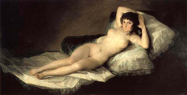
Goya's Maja desnuda is far more effective, IMHO, but I have always liked Goya better than ANY of the French impressionists (except maybe Renoir). Besides, she looks like she is a girl who enjoys a good time and has a twinkle in her eye . . . unlike Olympia who as somebody said just seems to be saying "Next!"
97
posted on
05/25/2005 7:21:47 PM PDT
by
AnAmericanMother
(. . . Ministrix of ye Chace (recess appointment), TTGC Ladies' Auxiliary . . .)
To: Republicanprofessor
Please ad me to your ping list. I am a huge fan of Winslow Homer and If I wasn't a broke farmer working 12 hours off the farm I would fill my crappy farm house with his reproductions.
I also appreciate the lectures and look forward to them all.
Thanks
IrishCatholic
98
posted on
05/25/2005 7:26:14 PM PDT
by
IrishCatholic
(No local communist or socialist party chapter? Join the Democrats, it's the same thing.)
To: Republicanprofessor
Thank you for the art appreciation class RProfessor. The Homer works are beautiful. My tastes have mostly tended toward American and Indian southwestern art paintings,pottery and sculpture. I'm also looking forward to your discussion of modern architecture. Please include me on your ping list. :o)
99
posted on
05/25/2005 7:44:11 PM PDT
by
Liberty Valance
(If you must filibuster, let the Constitution do the talkin')
To: The Great RJ
write how moved they were by a certain piece While in Las Vegas a few years ago, I visited Steve Wynn’s art collection, being shown at the Bellagio Hotel.
I was struck by how very, very good every piece he displayed was. Even his “modern” art was excellent.
It was somewhat of a sad irony though, as Steve Wynn has this beautiful art collection and he is losing his eyesight.
The piece that really struck me was Rembrandt’s Portrait of a Gentleman in a Red Doublet.
http://www.forbes.com/2001/01/24/0124pow.html
The online picture doesn’t even come close to showing how good this work is. I looked at it and obviously knew it was a painting, yet the skin appears to have the same semi translucent quality of real skin, it was truly remarkable.
As I looked at it, I thought, this is why the very best artists still try to compare themselves to Rembrandt van Rijn.
100
posted on
05/25/2005 7:51:17 PM PDT
by
RJL
Navigation: use the links below to view more comments.
first previous 1-20 ... 61-80, 81-100, 101-120 ... 141-144 next last
Disclaimer:
Opinions posted on Free Republic are those of the individual
posters and do not necessarily represent the opinion of Free Republic or its
management. All materials posted herein are protected by copyright law and the
exemption for fair use of copyrighted works.
FreeRepublic.com is powered by software copyright 2000-2008 John Robinson