
Got any CDC side by side comparison to 2009’s H1N1 (Swine Flu) where as the US had 60 million carriers, before Hussein stopped reporting?
Got any CDC side by side comparison to 2009’s H1N1 (Swine Flu) where as the US had 60 million carriers, before Hussein stopped reporting?
Recalculated
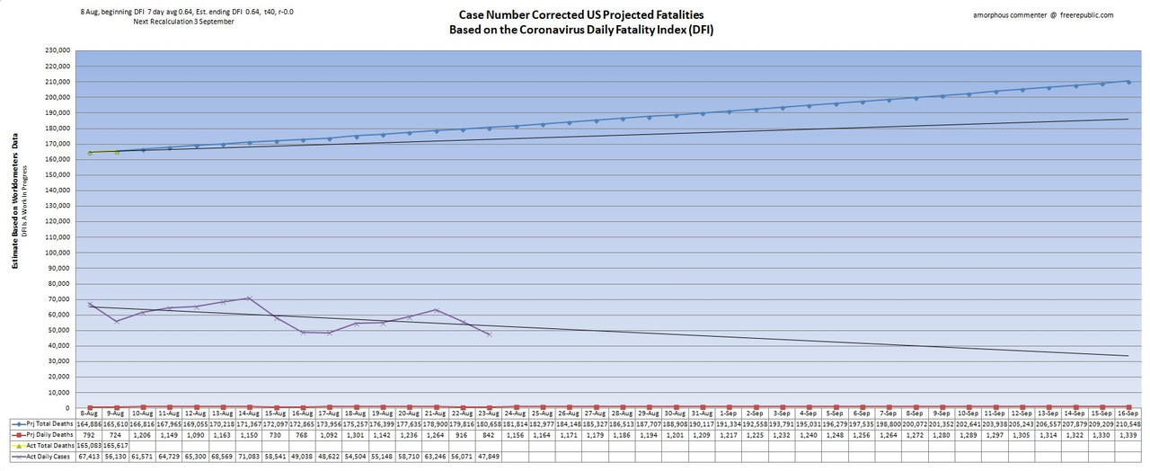
•Blue line represents projected death totals.
•Yellow line is actual death totals based on WorldofMeters.info data.
•Purple line is actual daily cases offset by 14 days.
•Red line represents projected daily deaths.
•Black extension lines are trend lines.
This sort of thing hardly helps with data consistency:
CA Public Health Director Tenders Late-Night Resignation After “Glitch” Delays 300,000 Test Results
http://www.freerepublic.com/focus/f-bloggers/3873154/posts