![]()
![]()
![]()
Posted on 07/01/2015 2:32:07 PM PDT by nickcarraway
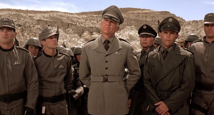
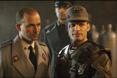
Star Wars has always had an association with Nazism. Of course, I do not mean this in a bad way, merely that the storyline has often been seen as allegorical to the events of World War II and the Holocaust. Furthermore, although never confirmed by Lucas and others, it has often claimed that the Empire represents The Third Reich, while Darth Vader and/or Emperor Palpatine is Adolf Hitler.
Regardless of the validity of these claims, it is apparently true that Fascist and Nazi iconography and typography was used to develop the iconic look of Star Wars. In fact, in one case, it lead to quite a heated debate about the inherent 'fascism' of a simple font.
According to a Hopes&Fears feature on movie fonts, George Lucas tasked designer Suzy Rice with creating a Star Wars logo that looked "very Fascist." Faced with this, Rice scoured books on fonts to find the one which most clearly screamed 'Fascist.' Eventually she arrived on Helvetica Black.
This font was then used as the basis for the Star Wars logo, although it was of course changed over time. When written in Helvetica Black with no additional alterations, the Star Wars logo looks a little something like this:
Rice chose Helvetica Black for several reasons. According to The Star Wars Poster Book, Rice had been reading a book about German typeface the night before Lucas asked her to work on the logo. Lucas' requirements that the logo had an "intimidating impact" on the audience immediately made her recall something she had read earlier. According to her source, Helvetica Black developed out of fonts often used by Joseph Goebbels for Nazi propaganda. She explained:
Apparently, the book established Helvetica Black as the inevitable evolutionary product of a typeface design that Joseph Goebbels had ordered to represent the German Nationalist party on all of its signage. Examples of this can be seen below:
However, Rice began to face criticism for apparently implying Helvetica was a Fascist font, with some kind of association with the Nazi party. This led to a rather severe debate within the typographic community about the inherent political orientation of a particular typeface. Initially, Rice gave a small defending statement, claiming:
Helvetica came much later but was described in this book I’d been reading as somewhat similar visually to that earlier signage. Unfortunately, that was not enough to quash the growing rebellion in her midst. Faced with more criticism, she went nuclear and posted a capital letter heavy blog entry in 2011. She exclaimed (apparently):
My original statement that Helvetica Black “was the most fascist font I could think of” was as to the ENVIRONMENT FROM WHENCE THE FONT ORIGINATED, the “general environment” of culture and time prior to, during and directly after World War II, and, as to the severity in appearance of the font itself. It was “fascist” based upon what I’d learned about how that font was developed and within what history epoch it originated — not “a fascist font” in and of itself but from a period of human, political history born of certain severe conditions WHICH ATMOSPHERE PROVIDED ME WITH AN INSPIRATION FOR THE DESIGN.
In the end, Rice would use Helvetica to inform her creation of Futura, the font which was eventually used for the Star Wars logo. It appears the typeface went through a few alterations, as illustrated by the posters below:
In reality, Helvetica actually originated after the war and was developed by Zurich typeface designer Max Miedinger in 1957. This is something also accepted by Rice, although she claims it still drew on primarily Germanic influences.
In fact, Helvetica appears to derive from a German font developed in 1896, decades before the war and Nazism. The font, named Grotesk, was designed by the Aksidenz Grotesk family primarily for use as a display type. For this purpose it had to clear, stark and strong - properties which subsequently made it attractive to propagandists. In this sense, these fonts were not designed to be inherently intimidating, although this could be seen as a side-effect of their strong legibility.
Furthermore, although fonts such as Grotesk did appear in Nazi party posters, it seems Goebbels and others much preferred the use of traditional Gothic fonts. These often harked back to Germany's imperial past and provided the right aesthetic for a political movement obsessed with legacy, a unified 'Volk' and the artist concept of heroic realism. Examples can be seen below:
If you want to find out more about the fonts on some of the most iconic movie posters - including Pulp Fiction, Back to the Future and Alien - make sure to head over to the full feature on HopesandFears.com.
![]()
![]()
![]()
Yes, I heard George Lucas say so himself in a DVD commentary, since he wanted to portray Palpatine’s Galactic Empire as a clear Fascist state, complete with Nazi-esque uniforms, “stormtroopers,” rigid formations, and Sith/SS occult symbology.
Starship Troopers
Fascists are always very good at managing their aesthetics. If you want something to look bold, powerful and compelling theirs is the lead to follow.
The SS uniforms of the Third Reich were clearly the inspiration for certain Star Wars garb. And Vader’s helmet/respirator bears a remarkable resemblance to an extended Nazi coal-scuttle helmet.
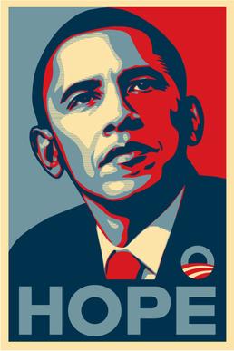
Why does that totalitarian socialist font make me think of "HOPE"?
“And Vader’s helmet/respirator bears a remarkable resemblance to an extended Nazi coal-scuttle helmet.”
Yep, when I made a “Vader clone” in an online game, I used the German army helmet with a samurai-style face mask. Pretty good approximation, everyone recognized who it was supposed to be.
That all being said, I have watched Star Wars and never noticed things of that nature as I was watching for the ENTERTAINMENT VALUE of the movie, NOT to politically analyze it.
LOL, yeah, right.
Hugo Boss designed the SS uniform
Vader's helmet and mask were, in fact, conceptualized using a German helmet and gas mask before the costume was sculpted. So even if Lucas was not trying to say "Empire = Nazis," Vader's appearance is more than coincidental.

OK. Let’s just boil it all down. Everything is either:
A. White Privilege
B. Nazi
C. Gay
D. Any combination of the above
 'Triumph of the Will' and 'Star Wars' side by side.
Disclaimer: Opinions posted on Free Republic are those of the individual posters and do not necessarily represent the opinion of Free Republic or its management. All materials posted herein are protected by copyright law and the exemption for fair use of copyrighted works.