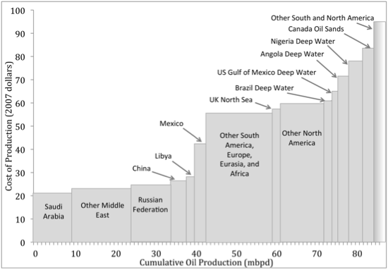
There’s another chart that someone posted that shows the same, but by “Cash Costs” of production. I think that chart, if correct, is more meaningful.