
We got the US Investors Are Loaded Up With Stocks in the morning reading list but the graph tells the story (imho). The flow of funds doesn't lie. OK, so liars quote the FofF all the time but what this says to me is that 2014 is NOT 1982 for stocks. Maybe for jobs but stocks are more like '65 or '97.
or '00 & '08...
What that chart is telling me is the rise in % households have in the stock market is due, perhaps entirely, to the rise in the S&P 500. I’d think that increase will disappear as soon as the smart money decides it’s time to leave.
That's in inflated dollars; here's real market cap growth:
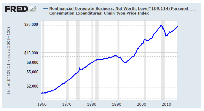
Apparently there's either a lot more to this than meets the eye or a lot less to this than meets the eye. Let me know if you want the numbers but it seems the last real $ dip was '89 - '97 and it was about the same % drop scale as the current one that began seven years ago. Somehow I don't remember the early '90's as being so bad....