The premise is that ice reduction is the effect rising CO2 levels which is the effect of population growth.
So if you depict population as exponential growth(which is imperative), then CO2 levels and ice reduction should also depicted exponentially
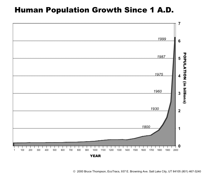

This diagram shows growth so flip it over to show reduction.
{snip}
Yes, but your example shows two entirely different sets of numbers,
The chart I showed is essentially the same number sequence (ice level over 30 years) as the scary exponential one...:^)
The premise is that ice reduction is the effect rising CO2 levels which is the effect of population growth.
So if you depict population as exponential growth(which is imperative), then CO2 levels and ice reduction should also depicted exponentially