2 years of hard facts is not the same as 30 years of hard facts.
And of course nobody can dispute the possibility that the last 2 years is the beginning of a new 30 year trend that results in 2040 having the same amount of ice as there was in 1980
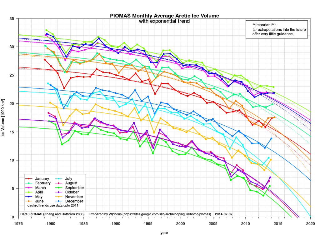
And it can all be in how you draw the data presented. The same 30 years
Your curved line chart looks far scarier than the actual data from the Danish Ice tracking folks -

And you could almost interpret the last few years an an uptick, not and exponential decline...:^)
http://arctic-roos.org/
