yup pretty much a straight line until 1912.
http://www.ritholtz.com/blog/wp-content/uploads/2013/08/2.jpg
Ritholtz got a few things right with his graph--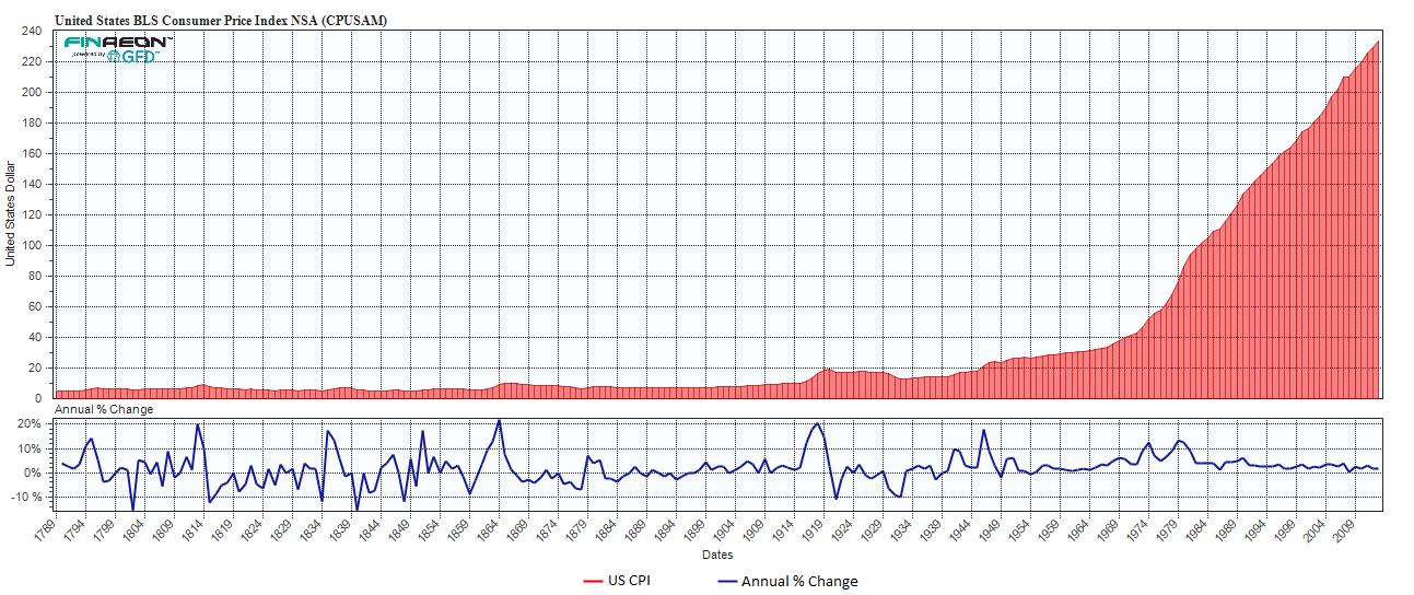
--but I got two problems with it. One is that when he got his numbers from http://www.measuringworth.com/uscpi/, he left out from 1775 to 1791 which included the wildest swings. The other is that people that know how to use money are more concerned with what prices will be next year than what they'll be in the next century --they want to pay off loans and feed their families (duh!). Here's the same graph corrected to show all years and with the emphasis on purchasing power: