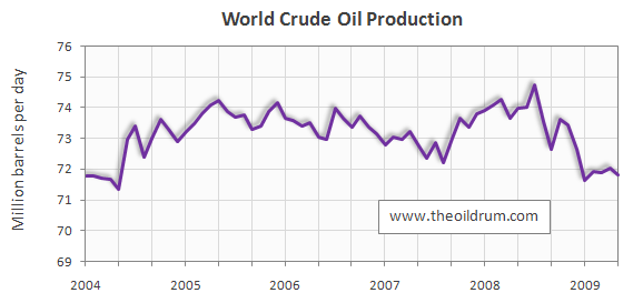
The chart you posted does not seem to jive with the chart taken from Forbes ( see Post #1), which chart is to be believed ?
Anyone have a long term chart of like a DOW energy index chart. I guess a long term Yahoo Finance chart of Exxon might work. Yahoo on exxon goes back to about 1970. Looks like in 1970 it was $3 to 4 which is worth $66.58 today not including dividends. So you would have increased your money about 16 times over a 40 year period with probably an avg dividend yield of 2.5% as icing on the cake.
I would think long term - energy would be better than gold. Holding something like SPDRs Energy ticker XLE.