Posted on 11/24/2013 7:05:36 AM PST by LS
I want to see a map showing the percentage of people living at each year of age.
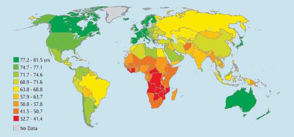
Found this as well, while looking for something else.
http://www.cbo.gov/sites/default/files/cbofiles/ftpdocs/91xx/doc9104/04-17-lifeexpectancy_brief.pdf

And this does not take account of high US obesity, which perhaps only tangentially implicates the health care system. While I don't have data handy, you might also want to look into the heroic efforts the US makes to save premature infants. This means that many stillbirths in Europe are infant mortality here, which drives up our IM rates and lowers our LE, but for noble reasons.
Such as ?
I want a graph showing the number of people living at age 1, then, each succeeding year, the number would drop according to the number remaining alive. It would show the ages at which most die off.
Good idea. Let's see what's out there.
Here's a good article covering England & Wales.
What do people die of? Mortality rates and data for every cause of death in 2011 visualised

Compressed Mortality, 1999-2010 Results
Great, thanks.
Disclaimer: Opinions posted on Free Republic are those of the individual posters and do not necessarily represent the opinion of Free Republic or its management. All materials posted herein are protected by copyright law and the exemption for fair use of copyrighted works.