Posted on 08/27/2013 5:25:11 PM PDT by rickmichaels
yowza
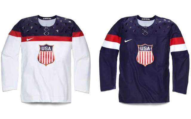
That’s a crappy costume. They should have had a comic artist design the jersey as they usually have some pretty good ideas, like this one for example.
http://4.bp.blogspot.com/-o4pw0IvBzp8/UKzobcQKHCI/AAAAAAAAS6k/hY4B5-sIYck/s640/cmjm.jpg
Considering the part of the world this fiasco will be held in, why no flak jacket?
I still remember watching every single 1980 USA Olympic hockey game. My friends thought I was nuts but by the time the Soviet Game came, they were glued to the TV and we screamed our heads off as those magnificent college boys hit everything in red that came near the puck. Then Reagan came. Ahhhh, good times.

Paul Martin and Ryan Miller take part in a press conference introducing the 2014 USA Hockey Olympic Team candidates at the Kettler Capitals Iceplex on August 27, 2013 in Arlington, Virginia.
The design itself is rather traditional—but the sprinkles on the shoulders and the fake laces? Gay.
Ummm....G to the A to the Y........
Paul Martin looks pissed. Those are some ugly jerseys.
This is hockey — shouldn’t the uniforms be a little more intimidating?
Wussies....
horizontal (or vertical) stripes would be better!
*snicker* Kind of like an upside-down Wonder Woman.
http://ts2.mm.bing.net/th?id=H.4925482469951789&pid=1.7&w=150&h=112&c=7&rs=1
http://www.floppingaces.net/wp-content/ramirez10.jpg
from the stands I bet it looks like pigeon crap on a statue...
‘Looks like the barber didn’t clean up after the haircut ....
Dandruff?


Nike, declaring the uniform is the product of “decades of design” So we could have won earlier if this cheesy looking POS. Decades of design. Which one?
Disclaimer: Opinions posted on Free Republic are those of the individual posters and do not necessarily represent the opinion of Free Republic or its management. All materials posted herein are protected by copyright law and the exemption for fair use of copyrighted works.