

Posted on 05/11/2006 3:04:49 PM PDT by Republicanprofessor
It is definitely time to finish my series of art “lectures.” So today I want to explore Neoclassicism, from about 1780, to Romanticism in the 1830s and 1840s. The style just before Neoclassicism was the fluffy Rococo style. This in turn was a reaction to the heavy style of the Baroque, especially under the absolute monarch Louis XIV, whose home was in that little “hunting lodge” of Versailles. In contrast to King Louis’s massive weight, in body and in taste, we have the lighter “fluffier” forms of the Rococo.
My favorite is The Swing, on the right, by Fragonnard. What’s that man doing in the lower left? Looking up a lady’s skirt?! (Has anything changed in 270 years?) What is also interesting is the oblivious priest who pushes her swing. The foliage is more like the down from pillows than it is like real trees. Nothing is “realistic” and it appears almost like a dream. Love themes predominated in this period (shown well in movies like Valmont and Dangerous Liaisons)
The Neoclassical period, beginning about 1787, reacts against such frivolity. But let us first look at the inspiration for Jacques Louis David (1748-1825) in the work of the Baroque Neoclassicist Nicolas Poussin. In such works as In Arcadio Ego 1655 and St. John on Patmos Island, Poussin revived the Greco-Roman themes of morality with a perfection of realism. Note how the toga-attired shepherds are pondering the presence of a sarcophagus in the middle of perfect Arcadia. See how the poses echo each other and yet are reversed: standing figure ahead on the right and behind on the left? He thus creates an asymmetrical balance with just a bit of variety and movement that will be seen later (and updated with brighter color) in the work of Cezanne. (For more information on Cezanne, a very difficult artist to understand, see class 3: Cezanne and van Gogh; http://www.freerepublic.com/focus/f-chat/1419876/posts)


Now, a century after Poussin and the intermission of the lighter Rococo style, David returns to what we call a Poussiniste style in paintings such as Oath of the Horatii in 1784. All the light and fluffy aristocratic love themes are erased with a return to Greco-Roman morality and heroism.


In the left work, Oath of the Horatii from 1784, three Horatii brothers are getting ready to fight three opposing brothers, the Curatii. They create muscular, masculine angles as they swear to their father that they will fight to the death. On the other side, the rounded women are weak and upset because they will lose either a brother or a husband (one is a sister of the Horatii who is married to one of the opponents; the other is a Curatia sister married to a Horatio brother). The outcome? One of the Horatio brothers survives the battle and wins. When he meets his sister outside the city gates, he doesn’t embrace her; instead he runs his sword through her because she was not loyal to their cause. The uncompromising morality in this work becomes a rallying cry for the French Revolution.
The Death of Socrates from 1787 is much the same: note the strongly outlined forms in classical togas and the rather dull color. Also note the muscular anatomy of Socrates at age 70; he is about to drink the poisoned hemlock and to die as decided by a Greek jury. His pose resembles that of Christ, complete with disciples gathered around him. Plato, seated at the end of the bed, bows his head with grief. His family is ushered out in the dull gray background. (Some in contemporary criticism have noted that the muscular disciple in red with the hemlock was a lover of Socrates….but we don’t have to go there.)
Some art historians have said that these paintings mark the end of traditional realism in painting, that the space no longer recedes indefinitely in perfect perspective (as in the work of Raphael and the School of Athens).

Yes, David's space is accurately rendered, but the gray background in both works is like a shallow frieze in a low sculptural relief; the figures pop out at us instead of having the background recede away forever. This use of figures thrusting forward is only more enhanced in twentieth century modernism.
After David’s death, Ingres became the preeminent neoclassical painter. (Note that David is pronounced Da VEED and Ingres pronounced very strangely; all vowels.) At first, the academy did not think a great deal of Ingres’ work. See how distorted the lower back is in the one on the left? David has added a few extra vertibrae; I think that the lower part of the back was his favorite part of a woman, and thus he so exaggerated it. That painting is called the Grand Odalisque. But when the Academy artists saw Delacroix’s work, they realized how neoclassical Ingres was in comparison and supported him as David's successor.

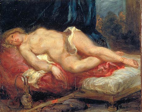
Ingres Grand Odalisque from the Louvre and Delacroix’s smaller Odalisque
First I should mention what an odalisque is: a woman of the middle eastern harems. She was not quite a prostitute but she was obliged to answer the needs of her master (and his friends). Now, this as a subject itself is more romantic than neoclassical, and Ingres’ deep and rich use of blue is not the dull, controlled color of David or Poussin. And yet Ingres himself did not realize what romantic tendencies he had in his work. And he succeeded in keeping his rival Delacroix out of the Academy for many years.
Delacroix’s Odalisque above is very different from that of Ingres. Can you think of a story, re the master and his relationship with his “ladies”? I see the Ingres as a pre-sexual encounter and the Delacroix as afterwards. Do you see suggestions of wild activity, violence, or perhaps even rape in the bloody red colors that Delacroix chooses? His brushstrokes are also much more blurred and emotional: showing all the qualities of Romanticism. Delacroix and his romantic colleagues were called the Rubenistes (as opposed to Ingres and David the Poussinistes). Delacroix's work was supposed to echo the looser, more painterly colors of Rubens--below--(even if his figures did not have Rubenesque bulk).

Romanticism in the early to mid-nineteenth century does not mean the valentines, roses and chocolates of today. Instead, it is derived from the Gothic “romance” novels of the time: with mystery, violence, death, and scandal. It is dramatic, moving, and everything that the preceding, controlled neoclassicism repudiated.


Two other notable Delacroix paintings are those above: The Death of Sardanapolous above and Liberty Leading the People below. Delacroix painted that sensuous nude in the first painting as a prerequisite to get into the Salon, but it didn’t work at that time. That painting is based on a poem by the romantic poet Lord Byron on the Assyrian king who, rather than be taken alive by the barbarians storming his gates, brought all of value into his chamber to have them destroyed before he himself set fire to the palace and died. This is a most romantic theme: full of the violence, tension of life and death, fiery reds, etc. (As an aside, the relationship between romantic poetry, music, and art is all very strong at this time: think of the dramatic late works by Beethoven, the poetry of Coleridge, etc. But that is another “lecture” in itself.)
By the way, the half-nude lady in the second painting is an allegory of Liberty. This reflects not the French Revolution of 1789 but a different revolution of 1830. (French nineteenth century history alternates frequently between empires and republican revolutions and their governments and is always quite confusing to me.)

One other dramatic work that I have to mention is Gerricault’s Raft of the Medusa, above. This was a major political scandal from the foundering of a ship, called the Medusa, en route from Algeria to France with Algerian immigrants. When the ship was sinking, the incompetent captain and crew claimed all the life boats. 150 people then climbed aboard the life raft seen here; after 10 days at sea (and cannibalism), only 15 survived. Here we see a father mourning his dead son, amidst other dead bodies, as a pyramid grows with struggling figures supports a figure who waves to a rescuing ship. This was a huge painting that, hung at eye level, made the disaster come alive to the viewing audience.
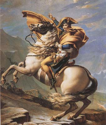

Another great neoclassical vs. romantic comparison is that of David’s Napoleon Crossing the Alps vs. Gerricault’s Mounted Officer. Notice how much more exaggerated and emotional the Gerricault is. I love the way the horse is rearing on tip-hoof, an impossible but highly dramatic pose. In regard to the David, note the names of Hannibal and other who also crossed the Alps for battle (barely legible in the lower left corner beneath Bonaparte).
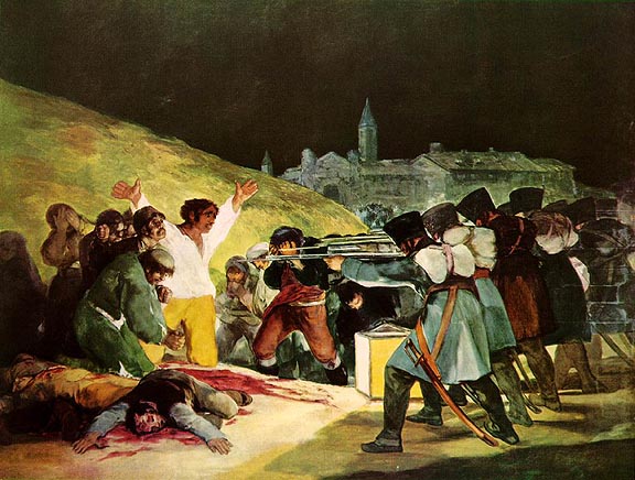
In Spain, Romanticism is best seen in the work of Goya, who, like Beethoven, went deaf shortly after 1800. He was able to conjure up the deepest ghouls and deathly visions from within himself that still can shock us today. His most famous painting is probably Third of May 1808 from 1814. Here we have Napoleon’s army executing those who rebelled the day before in Madrid. The angular machine-like soldiers on the right recall David’s Horatii above. The victims react in different ways: one man cries, the man in the center faces the squad with great bravery, his pose reflecting the crucifixion of Christ. A priest gives the last rites before he himself is killed. This violent death is very romantic: with all the blurred edges, bright color and dramatic contrasts of light and dark that we expect.


Goya was also a master of etchings, from his Disasters of War or Caprichos series.
In Germany, Friedrich was the master of romantic landscapes. His desolate graveyards, ruined cathedrals, barren winter branches, and spectacular, death-foreshadowing sunsets are still evocative today. In fact, if you crop the sunset, can you see Rothko? (For more on a recent thread on Rothko, check out http://www.freerepublic.com/focus/f-news/1628522/posts)


Finally, in England, we have two romantic artists. Constable is more of a romantic naturalist, but his evocative images of Sussex are always nostalgic and laden with his own life experience there.


Constable was one the first to use bright green to depict grass, seen best in Wivenhoe Park above with the cows. If you noticed in the early Poussin images at the beginning of this post, the trees tended to be rather brown. But Constable made studies outside (not in the studio), so he recreated the bright greens. In one anecdote, he confronted the complaining critics by putting a violin (the color of previous landscape paintings) on a green lawn and asked what color the lawn truly was. In addition, his specks of paint (to create the sense of light on foliage) was derided as “snow” by critics, but his painterly style influenced artists from Delacroix to Monet. He was also a master of clouds, writing the date, wind speed, and weather on the backs of his works.
Romantic as he was, Constable still looks tame compared to Turner. Turner’s early works were so realistic that one could almost recreate the rigging on his distant ships. But even in the early works one could see how it was really the sun, and its reflections, that most interested Turner.

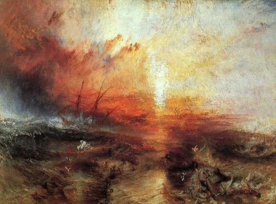
In Turner’s Slave Ship c. 1839 we see a disaster at sea. This is all the more tragic because the owner was insured against loss at sea but not against sickness and death, so the ill slaves are tossed overboard. (This piece sickens me each time I discuss it. See the parts of bodies in the right foreground?) However, the captain gets what’s coming to him, for he is sailing into a tornado and will also be killed. How is this work romantic? The fiery sea dissolves into the sky without any firm separation; there is a painterly blur of bright colors, and a dramatic scene. (There is no way to recreate these colors from the internet or in traditional photos. One must simply see the work at the Museum of Fine Arts in Boston to truly appreciate it. It glows with passion.)
A few stories about Turner: if he was on a train in a storm, he would stick his head out of the window to feel the effects of the wind and rain in his face. Or he would have himself tied to the mast of a ship in a storm to feel the effects of wind, sea, steam, fire, etc. There are very few solid forms in his later works. Some of his sunset and sunrise paintings are almost totally dissolved of form. Again, does this remind you of Rothko, but one hundred years before the Abstract Expressionists?


Turner Sunrise Norham Castle c. 1845 and Rothko from the 1950s
It is not perhaps an illogical link between the Romantics and the Abstract Expressionists. Both groups were interested in exploring ranges of emotion through blurred, painterly color and dramatic contrasts of light and dark. The Romantics were the first to break free of the constraints of neoclassical control and the rules of art for centuries past. Perhaps we could think of the Abstract Expressionists as the last, and most extreme, result of that break over a century earlier.
It's been just about a year ago when I started this series of online classes. What I like most is the commnents and discussion afterward: so go to it. What other works do you like by these artists? What artists have I missed? What do you have a problem understanding?
In case anyone has missed the other "classes" or essays I've written up: here you go.
class #10: Postmodernism http://www.freerepublic.com/focus/chat/1473061/posts?page=17
class #9: Pop and Minimal Art http://www.freerepublic.com/focus/chat/1470726/posts?page=2
class 8: Pollock and Abstract Expressionism: http://www.freerepublic.com/focus/f-chat/1468241/posts
class 7: American Modernism: http://www.freerepublic.com/focus/f-chat/1440373/posts
class 6: Surrealism: http://www.freerepublic.com/focus/f-chat/1427099/posts
class 5: Cubism: http://www.freerepublic.com/focus/f-chat/1427099/posts
class 4: Expressionism: http://www.freerepublic.com/focus/f-chat/1424087/posts
class 3: Cezanne and van Gogh; http://www.freerepublic.com/focus/f-chat/1419876/posts
class 2: Impressionism and Post-Impressionism; http://www.freerepublic.com/focus/f-chat/1414727/posts
class 1: Realism: Manet and Homer; http://www.freerepublic.com/focus/f-news/1410117/posts
A new series of art history "lectures" designed chronologically from Egyptian art onward:
Art Appreciation/Education series II class #1: Greco-Roman Realism and Early Christian Abstraction http://www.freerepublic.com/focus/f-chat/1491050/posts
Art Appreciation/Education Series II class #2: Romanesque and Gothic Art and Architecture http://www.freerepublic.com/focus/f-chat/1498966/posts
Art Appreciation/Education series II class #3: Art of the Renaissance http://www.freerepublic.com/focus/f-chat/1528015/posts
Art Appreciation/Education series II class #4: Art of the Baroque http://www.freerepublic.com/focus/f-chat/1563367/posts
I have also begun a series on Visits to NYC and the art seen there:
Art Appreciation/Education: Visit to NYC I: Robert Smithson and James Turrell: http://www.freerepublic.com/focus/f-chat/1507874/posts
Blue Moon by John Haber: A review of Oscar Bluemner's retrospective at the Whitney (I wanted to write about Bluemner's work as my Visit to NY II, but I decided to post Haber's great article instead.) http://www.freerepublic.com/focus/f-chat/1507684/posts
Art Appreciation/Education: Visit to NY III: Elizabeth Murray: Return to Color and Energy http://www.freerepublic.com/focus/f-chat/1512127/posts
One other essay I wrote on Christo and his orange gates in NYC: http://www.freerepublic.com/focus/f-news/1348194/posts
A Visit to Lincoln Center http://www.freerepublic.com/focus/f-chat/1620124/posts
You can also get to these, and other images, on my home page.
Art Appreciation/Education ping.
The last of this series of "lectures."
Forgive the double ping if you are also on the Art Ping list.
Art Ping.
Let Sam Cree, Woofie, or me know if you want on or off this ping list.
bookmark
Rothko's colors are not found in nature - Turner's always are.
Rothko's shapes are symmetrical and static - Turner's never are.
I love Turner. I can't stand Rothko.
BTW, here's my favorite Ingres - showing clearly the impossible distortions that were often hidden in Neoclassical "realism" -

the Romantics were really more realistic, if you see what I mean.
Thank you. I thought Fragonard was spelled with one "n", but I guess spelling was more fluid back then.
My spelling may have been rushed as I did the essay.
Alas. No one is perfect.
That's OK, professor, you've done a great job!
There is something cloying about Ingres that bothers me more than his distortions. But Thetis is pretty rubbery in that work.
Ah, now that I know your interest in life is literary, it explains your knowledge and preferences in art.
Now, I know you must have seen some Rothkos in person, so I can't say that is the matter. The Rothkos with the hard edges are less intriguing than the blurred blocks, to me.
I'm probably pushing Rothko too much lately; I don't know why. Probably because I just finished teaching his work. When the exams are corrected, I'll be burnt out and move on to someone else....
I'm off to the Freeper cruise tomorrow and will be gone for a week. I'm starting to get the FT's already, LOL.
Save my place while I'm gone, heheh.
Leni/Bahama Mama
You must do SO MUCH work for those cruises.
I hope it is awesome.
Maybe sometime my husband (billorites) and I can get away from the kids and come.
Have a GREAT TRIP. And thanks for all your kind words!
He was a French political whore...
Thanks for this entire series...only wish I'd had more time to spend on the discussion end of things!
Thanks for this series. Now I just have to find the time to work through them all.
I hope we will not end up with flame wars between classicists and Romanticists (followed by bannings and suspensions). :)
And I agree with you - Ingres is somehow sicky-sweet and creepy at the same time. And his women aren't women - they're somebody's dream of women.
I prefer Gericault - although his madmen and his guillotined heads aren't for everybody, they are true.
Nice job. I see you've listed your other threads as well.
I look forward to read them. Thanks.
You are one reason FreeRepublic is great.
Thanks RP, these are very potent paintings.
There is an eerieness in Turner unique to him; the painting of his in the MFA in Boston, with the horses tossed overboard, is spectacualr and haunting once you've seen it in person.
Wow. Never saw this before. A regular Dagny and John Galt, eh?
Disclaimer: Opinions posted on Free Republic are those of the individual posters and do not necessarily represent the opinion of Free Republic or its management. All materials posted herein are protected by copyright law and the exemption for fair use of copyrighted works.