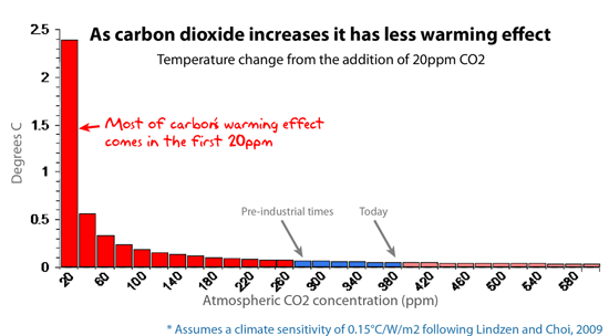
A patently false statement. The rate of absorption varies logarithmically with CO2 concentration, not linearly. A doubling of CO2 would only result in 20% more absorption. The "greenhouse" effect of CO2 is nearly saturated.
Ping for later reference.
I don't think that's right. You might mean "inverse log," but I don't think that's right either, as the graph seems to be showing the incremental contribution to warming of each additional/incremental amount of CO2. If the graph showed total warming vs. concentration, it would be an inverted hockey stick, increasing toward some asymptotic value. The first part of the graph would be steep, then it would approach horizontal (no increase, not a logarithmic increase) at higher concentrations.