
Posted on 08/31/2009 10:25:51 AM PDT by Tolik
The following is a transcript of Bill Whittle's video.
It works as a standalone article, but it's really better if you watch the video in all it's Afterburnery video glory here.(8 minutes)
THE CULT OF ICONOGRAPHY
I’d like to take just a few moments to talk about the power of Iconography. If you happen to be a high-level Republican strategist, you’re probably saying, “the power of Ica-what-now?” If you’re a high-level Democratic strategist, you might be thinking, “Aw, crap! He’s onto us!”
See this lovely steak dinner? Appetizing, isn’t it? Of course, if you put this in a blender and hit Puree, it comes out looking like this…

Exact same content. Different packaging. I believe the conservative message is, on balance, the most nutritious philosophical meal ever devised. But the packaging of that message has been an unmitigated disaster.

Here’s the stage from last year’s Republican National Convention. Wow. It probably took a good half hour to design, an maybe double that to build. It’s a giant square plank poking you right in the eye. Now look at last years DNC stage…

It looks like the entrance to Tomorrowland at Disney World. Look at how it’s lit! Look at those curving screens, leading the eye right up to heaven. It’s inviting, it’s warm, it’s new and exciting. If you don’t think this matters, I’m sorry to say you’re wrong. All of these elements have a profound impact on how people perceive the message. Even the choice of colors.
Now let’s just look at the power of simple shapes. Let’s take the tale of two classically simple pieces of iconography.
![]()

One line drawing conjures up a completely different set of emotions and expectations than the other one does… doesn’t it? Look at these two masterpieces of iconography. Look how simple they are. Can you begin to see how something this simple can conjure up so many images and feelings from your own childhood? The power of an icon is in its ability to evoke a subconscious emotional response. Advertising has a term for this. It’s called branding.

During the campaign season, it’s common to try and get an icon to stand for a candidate. George W. Bush used the “W” in his two presidential runs… the W off-setting him from his father’s same-name presidency. It’s not bad. But the application of it was strictly on lawn signs and bumper-stickers. Amateur hour, by today’s standards.

Now we come to the gold standard. From a pure design standpoint, I’ve always found this to be a little infantile. But the fact is, it’s a classic: plowed fields of grain, under the sunrise of a new tomorrow… all in the shpe of the “O.” “O” for Obama, of course. But also “O” for The One. The circle. Complete and self-contained. Sunrise and prosperity within the circle of life, and outside it nothing but barren emptiness. In terms of what it evokes it is a masterpiece, and the way the Obama team used it, and continues to use it, is absolutely brilliant.

Look at this image. It’s from the official Obama website. Notice how all of the traditional American iconography – the eagle, the stars, the flag, the motto: “e PLURIBUS UNUM – all are slowly fading out into a diffuse, heavenly glow, receding into the mists of memory, leaving only the glowing sun, the “O” pulling your eye into the future. And there are some very subtle and disturbing things here, as well. The American eagle isn’t perched, to remain here forever, but rather seems to be on the verge of flying away. The flag is falling. The stars are dissipating into the void. Our national motto: E PLURIBUS UNUM – “Out of many, One” is virtually unreadable.. . more like letters stamped in soft sand.
The only thing that is sharp and well-defined is the circle, the One, the “O.” That is what is permanent and immovable. Everything else is fading away. You think this is an accident? Think again.
Now when George Bush was elected, the W logo was put away for four years until it was dragged out again for his second campaign. But the Obama logo is still with us. At MyBarackObama dot com, we see images of a diverse group of citizens being called to “Organize for America.” Men and women of various ages and ethnicities.

What do they have in common? Go look carefully for yourself: they’re branded.
Mybarackobama.com is run by the Democratic National Committee. The new Democratic party logo is this:
![]()
…which is great by the way, dynamic and energetic, and a far cry from this stodgy, uninspired, static, child-like thing:
![]()
But this – pardon the expression – “kickin’” Democratic party logo appears nowhere on Mybarackobama.com. However, the Obama logo is everywhere. Everywhere.

It’s everywhere. They even tell you flat out it’s everywhere:
![]()
To the best of my knowledge, this is – again, pardon the expression – unprecedented. I believe it is unique in the American experience to brand an individual leader. The President of the United States has a logo. Here it is:

It’s a pretty exclusive club:. Barack Obama is one of only 43 people in the history of the world authorized to use this logo. (Grover Cleveland technically being both President number 22 and 24).

The fact that we see the Obama logo attached to health care proposals means that we are seeing an individual brand – that of Barack Obama – being used alongside and in many cases in place of the logo of the President of the United States. That is interesting and I don’t like it.
The man won the election and the right to use the Seal of the President of the United States. The fact that we continue to see the Obama logo used by the Democratic National Committee tells me that this is a perpetual campaign and that what they are branding is in fact an ideology centered around a Cult of Personality. We have seen in the past the dangers of branding an ideology with an icon. The two great totalitarian ideologies of the early 20th century both used powerful icons to represent their ideas. I will not show those here because it would be obscene to compare them and the horror they generated – 150 million dead, no less – to what is going on here, today. That was mass murder. This is merely advertising. We’ve just never seen this kind of thing before, in America.
The Obama logo has been powerful, but there is a weakness imbedded in that power of identity. If this logo is shorthand for all of the positives President Obama wants to project, then it can also be used as a shorthand for his negatives as well.


Lately, there has been an avalanche of anti-Obama merchandise…. Most of it centering around the ubiquitous “O”. Here in Los Angeles we have for years seen an iconic image by an artist named Shepard Fairey. A charming guy, one of whom’s collections is entitled E PLURIBUS VENOM.

We’ve seen his famous “OBEY” poster plastered all over LA for many years. The face is based on the wrestler Andre the Giant. It’s a powerful image. Shepard’s latest work is, of course, this:

…which is so striking that it immediately became the unofficial Barack Obama poster and rapidly produced any number of parodies.

But the worm is turning. Here’s Fairey’s work turned on itself. Not bad work.


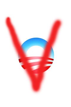
And this has been getting a lot of attention lately:

It appeared pasted on a remote pillar in essentially the middle of nowhere. Of course, LA Weekly called it an abomination, a call to a lynching, adding “all that’s missing is the noose.”

However, this image, published in Vanity Fair – not on a remote overpass by some unknown street artist, but rather by the editor of a major national magazine – was, on the other hand, hailed as brilliant satire and a remarkable statement on the sad state of American affairs.
The Obama/Joker is an excellent photoshop job, but as propaganda it could use some work. The Joker’s signature line was “Why so serious?” If you had done this…

… you would have had a masterpiece. This image works because of the fake smile hiding sinister intent. Many people are starting to get that impression of this President. This image has real power.
People obsessed with their own image expect some opposition. But there is one thing the true narcissist cannot tolerate…

This is the killer ap. I wouldn’t worry about the Joker poster so much, Mr. President. But if this catches on, and your policies are reduced to three-letter ridicule… well, sir, then you are in real trouble.
Bill Whittle links:
Freerepublic: http://www.freerepublic.com/tag/billwhittle/index
his videos at Pajamas Media: Afterburner with Bill Whittle
his blog Eject! Eject! Eject!
 Nailed It!
 I will try not to abuse the ping list and not to annoy you too much, but on some days there is more of the good stuff that is worthy of attention.
You are welcome to browse the list of truly exceptional articles I pinged to lately. Updated on August 24, 2009. on my page.
You are welcome in or out, just freepmail me (and note which PING list you are talking about).
Besides this one, I keep 2 separate PING lists for my favorite authors Victor Davis Hanson and Orson Scott Card.
So it’s not just what you say, but how you say it? Or in W’s case, whether or not you say anything at all?
Sorry W, your failure to articulate Conservatism set this country back a generation.
Where can I get those bumper stickers?

Ping — I think you’ll find this interesting.
I Love It!
Great Post!
Thank You!
If there is Bill Whittle ping list, I’d like to be on it. If it’s everything, I probably can’t keep up.
Bkmk
Great post! There are tons of creative conservative artists and designers who could go far with this “branding” idea. My guess is liberal money is financing the Dem creative efforts—don’t they control the marketing of most “creative” endeavors such as the recording and film industries? We need the same from the conservative side.
Big deal. The commies and nazis had their stylish icons too.
No, there is no Bill Whittle exclusive ping list, not that I know of. I ping to Whittle’s stuff more often than not, but I ping to other stuff as well. Check the list at my page.
Alternatively, you can bookmark Whittle’s pages (I provided links in the first post).
They took that stuff seriously. And it helped them to do more damage, IMHO of course.
Its part of info-war.
Look, an ugly stranger may be the most beautiful person on inside, but is there a chance you’d bother to learn? Is there a chance that an attractive person will have your ear sooner?
This kind of iconography is especially appealing to younger voters. Look at the great stuff young creative conservatives come up with here. Liberals use pop culture to educate their young voters. Conservatives need to do the same. I think it is a big deal..... The message young voters got during the last election cycle from their music, movies, tv, etc. was that Obama was “cool” and McCain was just some old man.
Thanks very much.
I hope so -- the last campaign, I couldn't help noticing that the Dem ads were miles better than the Republican. It looked as if the Republicans could only find liberal advertising people who -- even if they tried -- couldn't quite put their hearts into it. (Barney Frank's ads especially were terrific, all lies of course, but on the surface, intelligent, witty and just brilliant!)
Sore/Looserman was a power message on its own.
Disclaimer: Opinions posted on Free Republic are those of the individual posters and do not necessarily represent the opinion of Free Republic or its management. All materials posted herein are protected by copyright law and the exemption for fair use of copyrighted works.
