Posted on 12/23/2024 10:54:11 AM PST by Red Badger
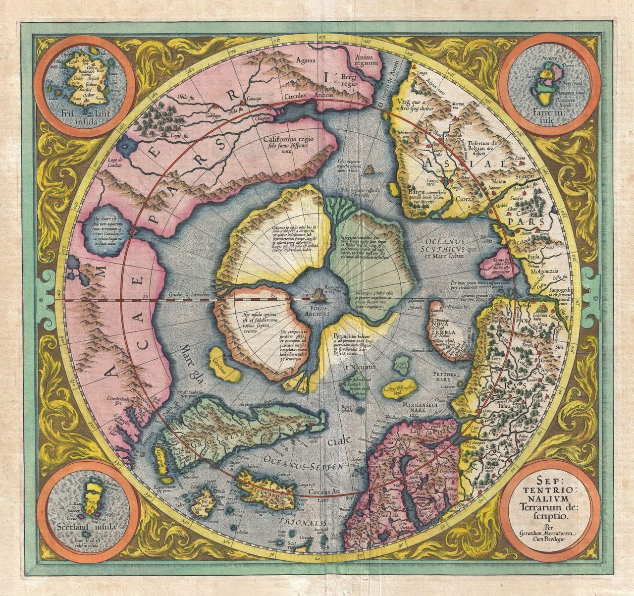
These days, climate scientists are looking hard at Arctic maps. As winter sea ice shrinks and cracks appear, they try to understand the reasons for these changes, and determine what we should expect in the future. Centuries ago, though, when people tried to map the Arctic, they weren’t too concerned with what was happening to it—they just wanted to know what the heck was up there. And, if they didn’t know, they pretty much made it up. Such was the case with the first known map of the Arctic: the Septentrionalium Terrarum, which is filled with magnetic stones, strange whirlpools, and other colorful guesses.
The map’s creator, the Flemish cartographer Gerardus Mercator, is best known for the “Mercator projection,” the now-famed method of taking the curved lines of the Earth and transforming them into straight ones that can be used on a flat map. The Mercator projection was invented for sailors, who, thanks to its design, could use it to plot a straight-line course from their point of origin to their destination. In 1569, Mercator came out with a map of the world based on this principal, which stretched from East to West and promised, in his words, “no trace… of any of those errors which must necessarily be encountered on the ordinary charts of shipmasters.”
In order to make his map useful for navigation, though, Mercator had to sacrifice accuracy in other areas—specifically, he had to stretch out the top and bottom parts of his map, making the lands and seas in the far North and South appear disproportionately larger than those nearer the equator. (This is also why so many people think Africa is the same size as Greenland, when it is really about 14 times bigger—the Mercator projection is still very common in schools.)
Under the terms of this Mercator math, the North Pole would appear so large as to be almost infinite. So instead of including it in the overall projection, Mercator decided to set a small, top-down view of the Arctic in the bottom left corner of his world map. Geographical historians consider this to be the first true map of the Arctic. Over the subsequent decades, as new information came to light, Mercator and his protégés enlarged and updated this original map—the draft above is an attempt from 1606, updated by his successor, Jodocus Hondius—but those original bones remained in place.
By the 1500s, not very many people had ventured up to the Arctic—no explorer would set foot on the Pole itself until 1909. This didn’t stop Mercator, who dug into some dicey sources to suss out what he should include. The most influential, called Inventio Fortunata (translation: “Fortunate Discoveries”) was a 14th-century travelogue written by an unknown source; in Mercator’s words, it traced the travels of “an English minor friar of Oxford” who traveled to Norway and then “pushed on further by magical arts.” This mysterious book gave Mercator the centerpiece of his map: a massive rock located exactly at the pole, which he labels Rupus Nigra et Altissima, or “Black, Very High Cliff.”
The presence of this formation was widely accepted at the time. Most people thought it was magnetic, which provided an easy explanation for why compasses point north. But Mercator was not quite convinced by this argument, and included a different rock, which he labels “Magnetic Pole,” in the top left corner of the map, just north of the Strait of Anián.
Mercator draws the Arctic in four large chunks separated by channels of flowing water, which meet in the middle in a giant whirlpool. He got this idea from two 16th-century explorers, Martin Frobisher and James Davis, who each made it as far as what is now Northern Canada. Both documented their experiences with vicious currents, which, they wrote, pulled giant icebergs along like they were nothing. “Without cease, it is carried northward, there being absorbed into the bowels of the Earth,” Mercator wrote on his original map.
Each piece of the Arctic also has particular qualities. According to Mercator’s labels, the one in the lower right is supposedly home to “pygmies, whose length is four feet”—likely another reference to the Inventio Fortunata, which described groups of small-statured people living in the polar regions. (It’s possible that the author of the Inventio was referring to the indigenous inhabitants of Lapland.) The one next door, on the bottom left, is apparently “the best and most salubrious” of all the chunks, although no evidence is given to support this—or to explain why the pygmies wouldn’t want to live there, instead.
After Mercator died in 1594, explorers continued to gain new knowledge of the Arctic, and cartographers revised their view of both Poles. By 1636, up-to-date maps of the region lacked Mercator’s four regions, along with the Rupus Nigra and the central whirlpool. Instead, they showed one large piece of land, surrounded by smaller islands and, often, adorned with the ship’s routes that enabled this geographical knowledge in the first place. As we peer at modern Arctic maps, wondering what changes are ahead, it’s fascinating to think back to Mercator’s original version, mysterious and broken from the beginning.
The second draft of the Septentrionalium Terrarum, released in 1606. Gerardus Mercator/Public Domain
DOGE needs to look at every active federal grant on the books.
I bet it’s more obscene than we can imagine.
><
Yes and yes. I’d bet it’s exceedingly obscene.
Problems, problems. Trust the Science.
The 1909 travelers claimed to have reached the North Pole, but it seems unlikely. Very uneven terrain, open sea in several places, and the claimed speed was 30% faster than later explorers managed, up until they hit open sea and were forced to return to base.
Gosh that must drive the Pygmies crazy!
There was a time when I hoped to buy an original antique map with one of those paintings on it of sea serpents and stuff.
Before I found out how hard to get something like that was that is.
And California where Alaska is today.
Great article. Thanks for all you do to keep FR interesting. I’ve read a lot of your posts this year. Merry Christmas and keep it going in 2025!
Get a replica. Of course the price on some of those will make you think you are buying the real thing. Also some of the 1930’s to 80’s charts are available online. My grandson was very interested in charts and maps. I bought him a globe and a replica.
1.North Pole
2.North Magnetic Pole, and
3.Pole of Inaccessibility.
Which is an entirely new one on me. Turns out to just be the remotest point from anything else just a few hundred miles from the others.
But learned the ANT-Arctic version of this point sports a statue of Vladimir Lenin courtesy of the old USSR.
The perfect polyp on the sphincter of the world.
“Yet it appears to show Hudson’s Bay in What is now Canada.”
Vikings?
I’m an artist. I wanted to own the actual painting.
Yes I considered that as well.......
Another thing I would really recommend is to teach children early (and adults who never had a clue) about the real scales of our own solar system. Mostly the planets are shown close together and close to the sun. Like here:
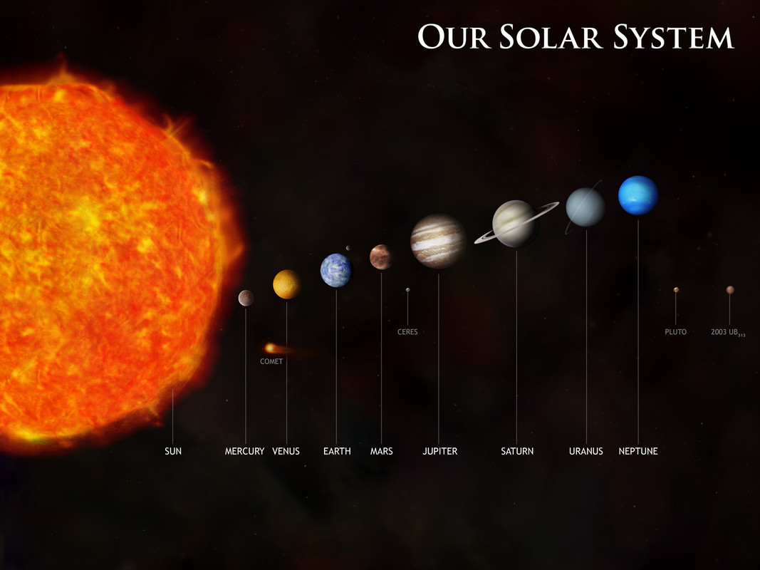
The reality of the sizes and especially the vast distances of empty space is stunning (and humbling, IMO).
https://solartoscale.com/ (vertical)
http://www.phrenopolis.com/perspective/solarsystem/ (horizontal)
Merry Christmas!
Disclaimer: Opinions posted on Free Republic are those of the individual posters and do not necessarily represent the opinion of Free Republic or its management. All materials posted herein are protected by copyright law and the exemption for fair use of copyrighted works.