Skip to comments.
Polarik's Final Report: <i>Obama's 'Born' Conspiracy</i>
The Greater Evil ^
| 09/17/2008
| Polarik
Posted on 09/17/2008 11:58:31 AM PDT by Polarik
click here to read article
Navigation: use the links below to view more comments.
first previous 1-20, 21-40, 41-60, 61-77 last
To: Polarik
Please do add me as a supporting expert.
I know for certain that’s the cause of that pixilation, and why it happens with regard to the image editor.
Your discovery that it was bittmapped is impressive, never would have probably find that out myself.
Usually, it’s a quick and dirty job with an existing JPG or GIF.
It’s mind-boggling how many people are clueless to this.
“Digital forgery” has been around for years, but is getting more common.
When Obama first posted on his website, my first though was “You can’t be serious, this will never fly”.
But low and behold, it has for the most part! Unbelievable.
The evidence you presented is proven in a scientfic manner, there is no “theory” about it.
Email if you like the steps, would be interested in seeing that. One of my acconts is jetxnet@yahoo.com.
61
posted on
11/25/2008 4:40:30 PM PST
by
jetxnet
To: Polarik
Something I wrote up about the pixilation
********************************************************
It really is amazing how many people don’t think BO could’ve forged his online Certificate of Birth. Digital forgery is nothing new and has been around for years.
Before this, no one has either been bold and/or dumb enough to take it to such a magnitude in attempting to fool the masses.
Myself, I have done some digital forgery. As a programmer, I never had time to play with graphics much, but still wanted my stuff to look nice. So what did I do? I just did an image search on the web and found banners, logos and borders I liked. Most of them had text already on them, so I just replaced that text with my own. Good as new, you can’t tell the difference, at least not from afar.
But, zoom in and whooaa Nelly, that ugly dithered, granulated, washed-out coloring of pixels between the text on the forged graphic. Needless to say, it annoyed me, but then thought to myself “well I couldn’t tell until I zoomed in alot, and most people don’t zoom in on the graphics, so no-one will notice”.
Sure enough, I even got compliments on a few! I had the last laugh i guess.
You see, on a non-forged image with text, the text is crisp, and there is no “color bleeding” of the text onto the background. I’ll explain why this is but may get a bit technical, so please try to visualize the concepts laid out here and apply what you learn.
I’m sure you have heard of image editors like Adobe Photoshop. These editors allow you to create and manipulate images. In order to allow you to edit any part of an image, the image editor reserves it’s own file extension to keep track of all that image’s properties. In this example, Adobe Photoshop has the file extension .PSD.
Image properties and attributes are things like how many pixels the image has, along with what each color of a pixel is. When you pull an image into Photoshop for editing, it detects the file format. If it is .PSD, the editor knows everything about the image. You can add text to the background and it will make perfect calculations as to what pixels should be colored to create the text, giving you a clean, clear-cut, color transition from the text to the background.
Over the years, image editors have become more sophsticated and now most allow you to directly scan images into the editor as the native file format to minimize “image loss”. In other words, the image editor will take an inventory of the scanned image’s attributes such as shape, size, colors and more. It does an OK job, but there is and always will be “image loss”, because the image being scanned isn’t native to the editor.
It’s great if you have an image where you do not need to alter or replace text. The image looks fine, but if you try to remove and/or replace the text on the orignal scanned image, low and behold, you were warned about “image loss”, now you get to it see up close and personal (but only if you zoom in).
The image editor creates a separate layer to super-impose that text onto the original foreign image layer. Think of an image layer as a separate, yet, transparent new image that will lay over the top of an existing one. Only if the text and background are part of the same image layer, will you not have “pixilation” abnormalties. Only the device that created the image originally can know the true properties of that layer, and this why the image editor automatically creates a new layer, because it doesn’t know enough about the existing one.
If you type the new text onto the scanned or imported image from a foreign source or of a different image format, it looks pretty-good. But, as stated before, if you zoom in, you will see this “glow” and pixelized discoloration around the text.
The glow is created because the image editor makes a guess as to what the original existing image layer’s pixel locations are. Remember, when you create/type text, the editor selects the pixels it will color to make that text. When you scanned or imported the non-native image into the editor, it made a calculation as to what the pixel size and locations were, relative to the properties and size demensions it discovered. It isn’t perfect though, so it makes a guess based on what it found selects the pixels on the new layer to color.
The distorted glow is the difference in “image loss” or mis-matching between the two layers. Think of it as the remainder of a math equation. Everything doesn’t compute perfectly, so it guesses and does a pretty-good job, but you still get the glow. If the text were part of the same layer as the original image, therer is no glow, because the math is nearly perfect in caculating which pixels to color.
Now, apply what you have learned. Of the two images (A and B) below, what image is forged and what one is not?
Image A: http://i282.photobucket.com/albums/kk248/jamie83pics/bc19.jpg
Image B: http://i282.photobucket.com/albums/kk248/jamie83pics/bc22.jpg
If you guessed, image B, then a Cigar for you.
62
posted on
11/26/2008 2:52:02 AM PST
by
jetxnet
To: Polarik
I have a question.
You are saying someone used one person's COLB as a template and replaced the text to create one for someone different.
Are you saying they replaced all the text on the entire document? Even the stuff that doesn't change, like the word "BIRTH"? And if so, why would they do that? Why not change just the personal data?
63
posted on
01/26/2009 9:17:50 PM PST
by
mlo
To: mlo
Even the stuff that doesn't change, like the word "BIRTH"? And if so, why would they do that? Why not change just the personal data?
I can answer your question.
The answer is simple, the length of the names can change the space used and with it the location of the information.
For instance "Joe Doe" takes up less space than say "Aleksandr Isayevich Solzhenitsyn" so depending on the name originally on such a document it may not have been possible to match the spacing used by the original text. Remember that the photoshop program cannot match whatever program the State of Hawaii used to generate their documents, so to get the proper spacing the easiest way to do so and make it look official is to use a blank sheet.
64
posted on
01/27/2009 8:16:41 PM PST
by
usmcobra
(Your chances of dying in bed are reduced by getting out of it, but most people still die in bed)
To: usmcobra
"The answer is simple, the length of the names can change the space used and with it the location of the information." I was asking why change the headers, which are static information? What you are saying doesn't answer that.
65
posted on
01/29/2009 7:27:17 PM PST
by
mlo
To: mlo
I was asking why change the headers, which are static information? What you are saying doesn't answer that.
Of course it does, you just want to ignore the fact that unless you change the font size (and I suspect there is a state statue that governs that size) with longer names (and Hawaii is famous for some long ones)the headers would have to move as needed.
You also ignore the fact that the headers may be manually inserted dependent on the amount of information displayed.
66
posted on
01/29/2009 8:19:16 PM PST
by
usmcobra
(Your chances of dying in bed are reduced by getting out of it, but most people still die in bed)
To: usmcobra
"Of course it does, you just want to ignore the fact that unless you change the font size (and I suspect there is a state statue that governs that size) with longer names (and Hawaii is famous for some long ones)the headers would have to move as needed." Look at the form. The header does not need to move for a longer name.
Stop attributing dishonesty to people just because you disagree.
67
posted on
01/29/2009 9:50:53 PM PST
by
mlo
To: Polarik
One of the pillars of Polarik’s forgery accusation is an alleged absence of green pixels between the letters of the word “BIRTH”. This instance appears at the end of the phrase “CITY, TOWN OR LOCATION OF BIRTH”. There are several interesting things to note about this accusation.
It’s part of a header which would be constant. If someone forged the birth certificate by using a real one and replacing the personal data, why erase the header just to put it back?
Why did Polarik pick this one word to build the forgery case, out of all the words on the birth certificate?
There are plenty of other words with plenty of green between the letters. What about them? Aren’t they forged too?
And, what proof is there that a shortage of green pixels between letters is a certain indicator of forgery?
But for now, let’s just focus on whether the observation of missing green pixels is true. Because, if it isn’t true, none of those other questions matter very much. Is there a green pixel shortage between these letters?
The green colored pixels come from the background pattern on the birth certificate stock. It is a hatched pattern of green strokes on white (Or a very light green. Calling it white is good enough for our purposes.) The strokes are alternately aligned vertically and horizontally, in pairs.
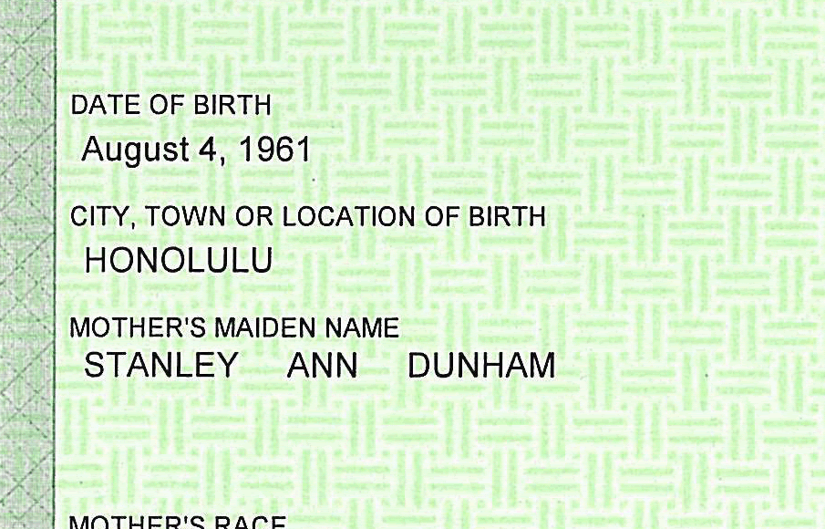
The black letters are printed on top of this pattern. Whether a pixel between two letters is white or green depends upon the position of that pixel within the hatch pattern.
Note the relative position of the word “BIRTH” with respect to the background.
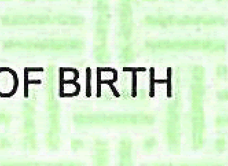
Simple visual examination reveals that the base of the word is over one horizontal green mark. This mark is the top mark of a pair. The left edge of the first letter, “B”, and the right edge of the last letter, “H”, are just touching a vertical green mark. In each case the second mark of the pair is further out from the word. Finally, the top of “BIRTH” just touches the bottom of a vertical pair of marks just above.
This means that upper two thirds or more of the word “BIRTH” are printed on white space, not on top of any green marks. The only place you would normally expect to see green pixels between the letters is at the base of the word where it overlaps the horizontal green mark. And we do see it there, just as expected.
There is no anomaly here. It looks just as it should look. All that’s happened is that Polarik has picked one of the words that was mostly printed on white, where he could attempt to make this argument.
Let’s look at some of the other ones he ignores.
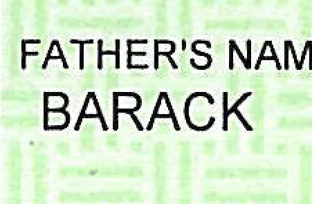
If someone forged this certificate they definitely had to change the name to “BARACK”. But there’s plenty of green between letters here. Why? Well, because the letters obscure both members of the pairs of horizontal marks it overlaps, and there are vertical pairs that overlap the word too. It’s printed on plenty of green space, it isn’t printed on mostly white space.
And the word right above, “FATHER’S”. Plenty of green there too. Again, because it is printed on green, not mostly white space.
All Polarik has done is pick out a word that is mostly printed on white space, and tried to make people think something is wrong with it because the background is mostly…white.
Need more?
The allegedly improper “BIRTH” image can be recreated by simply superimposing the black letters along with the white “ringing” artifact over a part of the background without any printing. This should not be possible, according to Polarik, because if we don't erase the underlying image first we aren't removing any green pixels, and our replication should have more green between the letters.
First, using Photoshop use the selection tools to select the letters in the word “BIRTH” and then expand that selection around each letter. This is to capture the white “ringing” around the letters.
That gives this image. This is pasted onto a red background so you can see where it is transparent.

Now take that image and paste onto an unprinted area of the certificate. There’s plenty of unused space. Right under the source “BIRTH” will work fine.
Position the pasted in letters so that they line up with the green hash marks just the same as the original “BIRTH” does. Left edge of “B” just touching the vertical mark, right edge of the “H” just touching the vertical mark, base of the word over the horizontal mark. Aligned just like the original. The original is on top, the copy on the bottom.
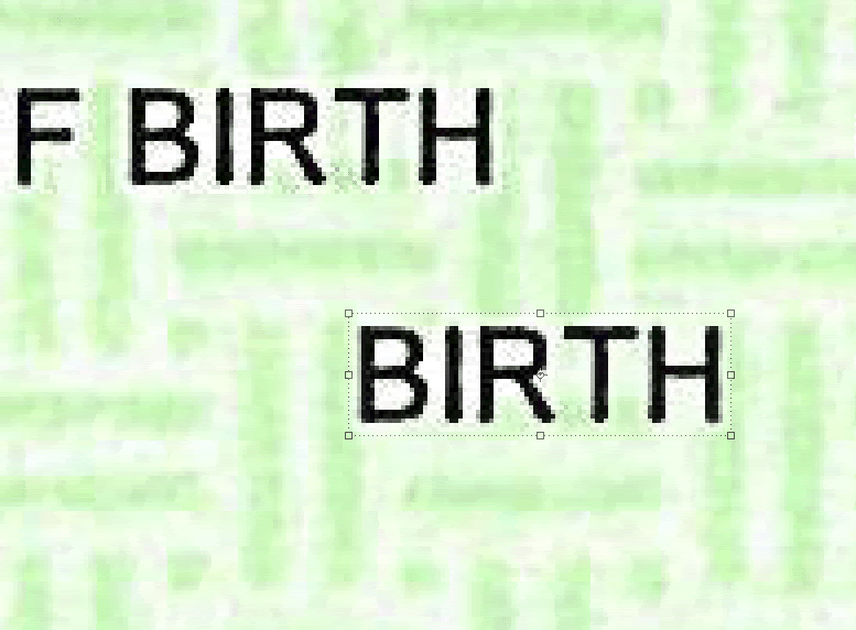
Now if Polarik’s is correct, there should be some extra green in between these letters. Because to make this, we didn’t go erase any old lettering and replace it. That’s what is supposed to account for the missing green. Does that happen? Is there more green in our newly printed “BIRTH” than in the original “BIRTH”? Let’s bring up the color for a good look.
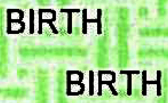
No, there is no missing green in the original (top) “BIRTH”. Just like the bottom version, the white comes from being printed on a white part of the paper, and the pixelization from the “ringing” artifact.
We should emphasize that Polarik has never demonstrated that “missing green” is proof of forgery. He just says so. But that question needn’t concern us now because the observation of “missing green” is false in any case.
68
posted on
01/29/2009 9:59:28 PM PST
by
mlo
To: mlo
You came to this old thread to try to dispute Polarik. What is your obsessive interest in this birth certificate issue? He's a fraud. It doesn't matter if it's the bc or another issue. His past will catch up with him and if the past doesn't the present will. He won't last. He's a socialist, people are already onto his POS stimulus package that is nothing buy pork for his radical social agendas. You need to get over it, he isn't your Messiah, he's just a little Chicago boy and he has to earn respect and so far he has a D-.
69
posted on
01/29/2009 10:05:10 PM PST
by
mojitojoe
(THAT SILLY LITTLE WIMP IS NOT MY PRESIDENT)
To: mojitojoe
What is your obsessive interest?
"His past will catch up with him and if the past doesn't the present will. He won't last. He's a socialist, people are already onto his POS stimulus package that is nothing buy pork for his radical social agendas."
Let's hope. He should fail and be rejected on these legitimate issues. Making up fantasies is something else.
"You need to get over it, he isn't your Messiah, he's just a little Chicago boy and he has to earn respect and so far he has a D-."
You need to get over thinking that people who don't buy into silly fantasies about birth certificates and such must worship Obama. Be rational.
70
posted on
01/29/2009 10:20:18 PM PST
by
mlo
To: mlo
When you are being dishonest for the sake of argument I must point it out.
let’s say that the headers can move for a number of reasons including the simplest of all, human or machine error, we are talking about a black form where the information is as well as the amount of different headers is inserted by computer, to deny that the possiblity exist that these headers can be move around as needed or by mistake or misalignment is patently dishonest.
One does not search for the truth by suggesting a lie as the basis for their claims.
71
posted on
01/30/2009 4:32:11 AM PST
by
usmcobra
(Your chances of dying in bed are reduced by getting out of it, but most people still die in bed)
To: usmcobra
"When you are being dishonest for the sake of argument I must point it out." You pointed out no such thing.
"let’s say that the headers can move for a number of reasons including the simplest of all, human or machine error..."
It seems you've forgotten what we are talking about. The question was, why would a forger change the headers just to put them right back. They don't need to change.
"One does not search for the truth by suggesting a lie as the basis for their claims."
Talk to Polarik about that.
72
posted on
01/30/2009 5:59:54 AM PST
by
mlo
To: mlo
You still assume that the original document was a COLB, from other evidence such as in the border it appears to be constructed from various sources to duplicate a COLB.
Why? I have no clue but that is what it appears to be.
73
posted on
01/30/2009 6:51:53 AM PST
by
usmcobra
(Your chances of dying in bed are reduced by getting out of it, but most people still die in bed)
To: usmcobra
The border is consistent with a valid Hawaii COLB. There are other examples of it.
74
posted on
01/30/2009 11:07:01 AM PST
by
mlo
To: mlo; usmcobra
The border is consistent with a valid Hawaii COLB. There are other examples of it. Yeah, it's consistent for Hawaiian COLBs for the year 2008 not for borders used in 2007 the year Obama's COLB is date stamped.
So mlo when are you going to explain this inconsistency below?

To: mlo
Even the misaligned splices?
76
posted on
01/30/2009 1:48:20 PM PST
by
usmcobra
(Your chances of dying in bed are reduced by getting out of it, but most people still die in bed)
To: Red Steel
"So mlo when are you going to explain this inconsistency below?" When are you going to acknowledge that the missing green pixels issue is a fiction?
77
posted on
01/31/2009 9:49:36 AM PST
by
mlo
Navigation: use the links below to view more comments.
first previous 1-20, 21-40, 41-60, 61-77 last
Disclaimer:
Opinions posted on Free Republic are those of the individual
posters and do not necessarily represent the opinion of Free Republic or its
management. All materials posted herein are protected by copyright law and the
exemption for fair use of copyrighted works.
FreeRepublic.com is powered by software copyright 2000-2008 John Robinson


