To: KarlInOhio
I messed with this a little. First, I got screen captures of the two different images.


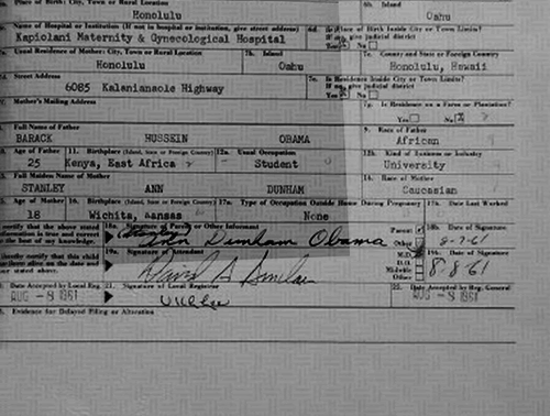
Then, I overlaid one atop the other and did a video of the transition between the two. Pay attention to the first "a" in the words "East Africa" and the first "S" in "Hussein".

Why do several elements of the foreground appear to be moving independently of the background in that animation? Notice on the right, the numbers 9, 12b, and 14 appear to move to the left, independent of the background. Definitely weird. I agree that strange things can happen, but I've never seen whole letters move up and down a page like this, nor foreground elements ever move across a "safety paper" background. Notice also the dot below the "S" in the David A. Sinclair picture. The last name in the signature moves in relation to the dot, but the first name/MI stay put. WHY?
11 posted on
06/20/2012 9:48:07 AM PDT by
FLAMING DEATH
(Are you better off than you were $4 trillion ago?)
To: FLAMING DEATH
The shrinking capital E on East Africa is hilarious.
BTW, can someone do a close-up of the raised seal on Savannah’s photos and compare it with the seal on the letter of verification sent to the Mississippie Democrat Excecutive Committee?? The latter is what an official raised seal looks like. The seal on Savannah’s, I’m pretty sure, looks nothing like that. It’s as clear a sign as any that the the LFBC is a sham.
13 posted on
06/20/2012 10:05:43 AM PDT by
edge919
To: FLAMING DEATH
Your animation is much more convincing than anything posted by chatter4. The fact that the numbering shifts so far to the left and the way the signatures realign is a bit strange.
14 posted on
06/20/2012 10:07:58 AM PDT by
bolobaby
To: FLAMING DEATH
When you line two layers up in Photoshop, ONE LAYER MUST BE SCALED, SKEWED, OR DISTORTED TO MATCH THE OTHER IDENTICALLY due to differences in camera angles of the original photographs and here they are not lined up precisely. This accounts for the shifting in your animated gif.
To: FLAMING DEATH
I'm not worried about the safety paper background. It is not from the original BC but rather what the microfilm (or digital scan of the microfilm depending on how they store it now) is printed on. Tweak the printer and the letters can move around the background because of slight changes in the paper location, twist in the printer or zoom level when printed from two different printings of the same Hawaiian originals.
The most interesting parts are the shift of the 9, 12b and 14 relative to the vertical line next to it. I don't know if that shift is from sub-pixel scanning errors on the low resolution grayscale image or if it is real. I'm not willing to brush it off like I have a lot of other claims to proof of a forgery which were obvious image processing artifacts. Very interesting. Thanks.
16 posted on
06/20/2012 10:20:24 AM PDT by
KarlInOhio
(You only have three billion heartbeats in a lifetime.How many does the government claim as its own?)
To: FLAMING DEATH
Here you go.. These are the two Savannah Guthrie photos, aligned and layered into an animated gif. The document is the same:
To: FLAMING DEATH
My last comment on this.. Since color is not an issue in this analysis, it helps to convert both images to grayscale prior to comparing.
To: FLAMING DEATH
Thanks for showing this! Sure is strange, isn’t it? The layer with the text isn’t matching up with the layer with the background.
FreeRepublic.com is powered by software copyright 2000-2008 John Robinson